There’s a science as to why particular designs catch your eye and get your blood pumping.
The human brain is lazy, biased, and prone to shortcuts.
The user experience study of human cognition can be mushy, unscientific, and filled with false assumptions—perhaps it’s the fault of a lazy brain.
Cognition is complex, and many factors play into gut reactions or an instant impression. When you ask someone, “Why’d you do that?” there’s a high chance they won’t be able to answer or that you’ll misinterpret their response.
Enter neuroscience.

While research methods like observation and interviewing often require the UX researcher and participant to make guesses, modern technology like eye tracking allows researchers to study nearly imperceptible reactions and preferences.
In the case of products with substantial traffic, seemingly tiny details like the width of a button or the color contrast of text can make millions of dollars of difference. That’s why tech giants like Facebook and Google are beginning to employ neuroscience-based techniques to study how people use their products.
Let’s start with an introduction to reactive, “fast thinking” and provide a few tips for designers to help leverage the power of neuroscience in order to create great user experiences.
Design Psychology: Fast Thinking, Slow Thinking
It is no secret that much of what drives human behavior is subconscious. In the milliseconds after a person encounters a new app or website, millions of neurons fire and the brain makes hundreds of subconscious decisions.
Am I in the “right” place? Should I trust this site?
YouTube UX Researcher Javier Bargas-Avila determined in a 2012 study that people form aesthetic reactions to a web page in the first 17 to 50 milliseconds after exposure.
To put that into perspective, it takes the eye 300-400 milliseconds to blink. Your product may receive its trial, judgment, and sentence all in less than the blink of an eye.
These impressions might not register, but they do impact behavior. For example, if a site loads slowly and the brain reads the first items that load as “off-topic” the user may navigate away immediately rather than wait for the site to load.

Companies like Facebook invest significant resources into studying load order of elements. If someone logs into Facebook and doesn’t see any notification badges, they may navigate away instantly. If the badges load first, they may wait while the content-heavy News Feed loads.
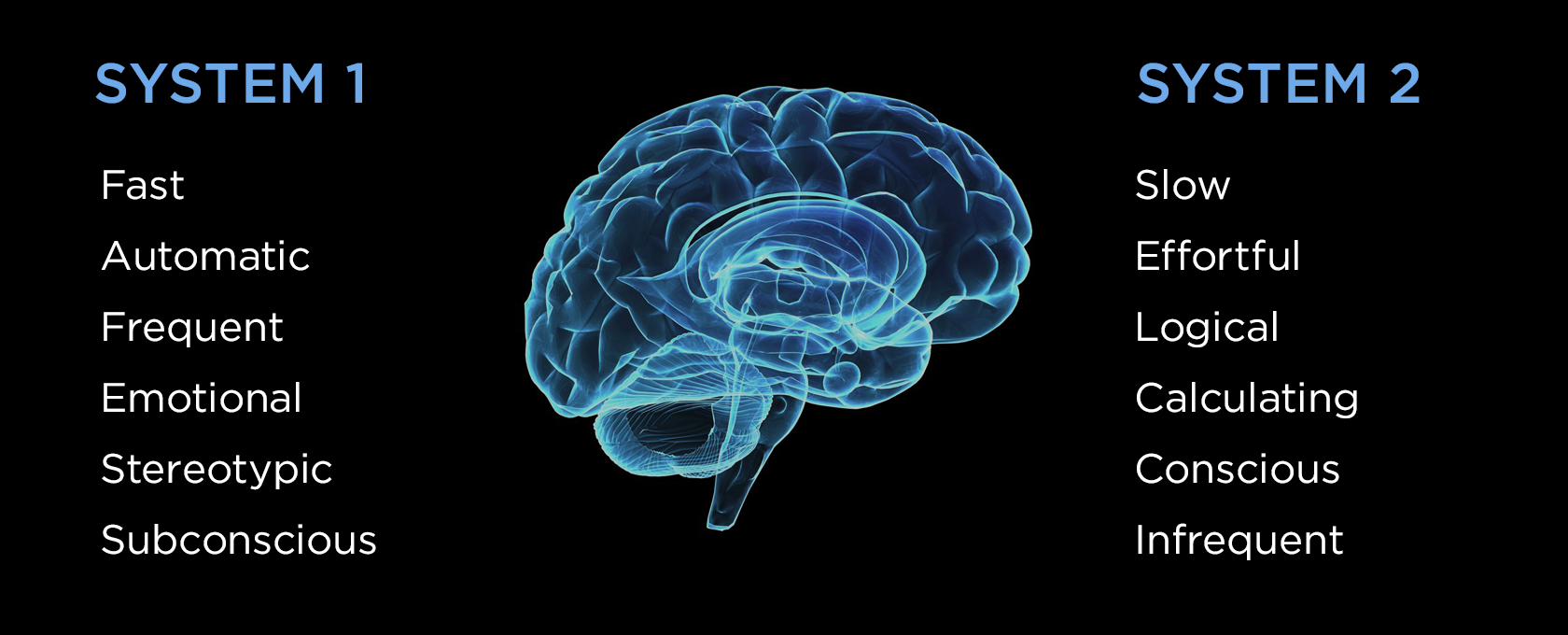
Nobel laureate Daniel Kahneman’s book Thinking, Fast and Slow breaks human thought and decision making into two systems to help illustrate the difference.
System 1: fast, automatic, frequent, emotional, stereotypic, subconscious.
System 1 thinking is reactive—responsible for complex but instinctive cognition like determining the distance between objects or determining emotional responses. Your lazy brain generally defaults to System 1 thinking.
System 2: slow, effortful, logical, calculating, conscious, infrequent.
System 2 thinking is analytical and is applied to more complex scenarios, like determining appropriate social behavior or comparing two products with different prices and characteristics.

Since the brain doesn’t want to re-process information or make novel decisions every time it is faced with a new scenario, much of human decision-making falls into System 1, or “fast thinking.”
When making decisions quickly the brain can over-rely upon schemas or mental models—familiar patterns of information and interaction. When System 1 thinking is engaged, System 2 never kicks into effect. People may not be aware of their brain’s decision-making shorthand, but it strongly impacts their behaviors and perception of the product.
The Science of Psychology in Design
The human brain consumes a whopping 25% of the body’s oxygen despite making up only about 2% of its mass. The brain is lazy as a survival mechanism—pattern recognition and shortcuts mean less energy spent consciously processing the situation. The brain identifies things, labels them, and ignores them until they’re relevant again.
The brain’s preference for patterns and lazy decision making might make survival easier, but it makes UX design more difficult. How do you study something your research subject can’t even perceive?
A handful of neuroscience techniques have recently made the jump into UX research, helping researchers shed light on the things that stimulate “fast thinking.”
Attention and perception can be studied with eye-tracking cameras. Emotional response and arousal can be determined with skin sensors or facial analysis. Electrical response in the brain can be measured with electroencephalography.

To designers, it might sound like an impossible task to capture someone’s interest and convey vital information in less than the blink of an eye. Luckily, just as neuroscience can help us diagnose problems, it can also reveal general solutions and best practices.
Here are a few general lessons learned from neuroscience user experience research that designers can employ when designing digital products.


