You know how it works.
Casually watching a review on Unbox Therapy about this mug that apparently is unspillable. I’m having a laugh but by the end of the video I’m also intrigued what people ask for it.
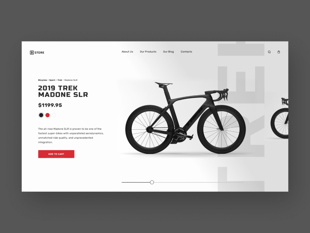
There it is on Amazon. On sale at $14.99 from $24.99. For a limited time only. Only 3 left in stock for the stainless steel version. I love stainless steel. It’s a bargain and it will soon be gone. I’ll be left to drink coffee from my spillable mug. It would be a shame to pass this.

It makes things desirable
Scarcity is the psychological bias that makes us place a higher value on things that are scarce than those in abundance. Basically, we tend to like things that are harder to obtain.
It has become the norm
As most things, scarcity started offline. Expensive restaurants serve small portions on large plates to suggest that ingredients are rare and prestigious colleges have limited places to maintain the sense of exclusivity.

But as tech businesses became more mature and digital products more refined, scarcity was quickly adopted online and it is now one of the most popular methods to increase desirability.
We have come to a point in which people are so used to seeing and expecting some form of scarcity when browsing online, that implementing one inside your product is not a competitive advantage anymore but a starting point for any goal that aims to satisfy users’ needs.
It combines multiple biases
Scarcity became popular because it’s extremely powerful and fairly easy to implement. And the reason it’s so effective is because it combines multiple biases into one:
1. Loss aversion
If we don’t act upon a scarce product, it basically means we’ll lose both the product itself in the short run but also our freedom to choose it in the long run. Double the loss = double the pain.
2. Social proof
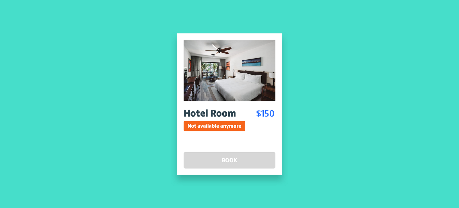
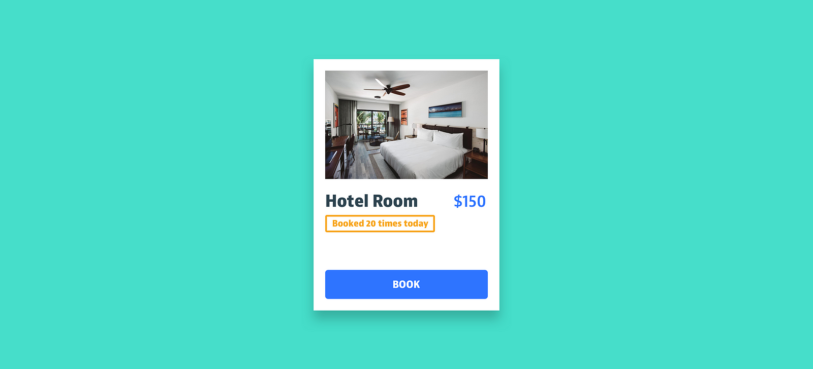
Usually, products become scarce when the demand is high. Once that happens, it implies that other people bought it in the past so it must be valuable and we should seize the opportunity.
3. Anticipated regret
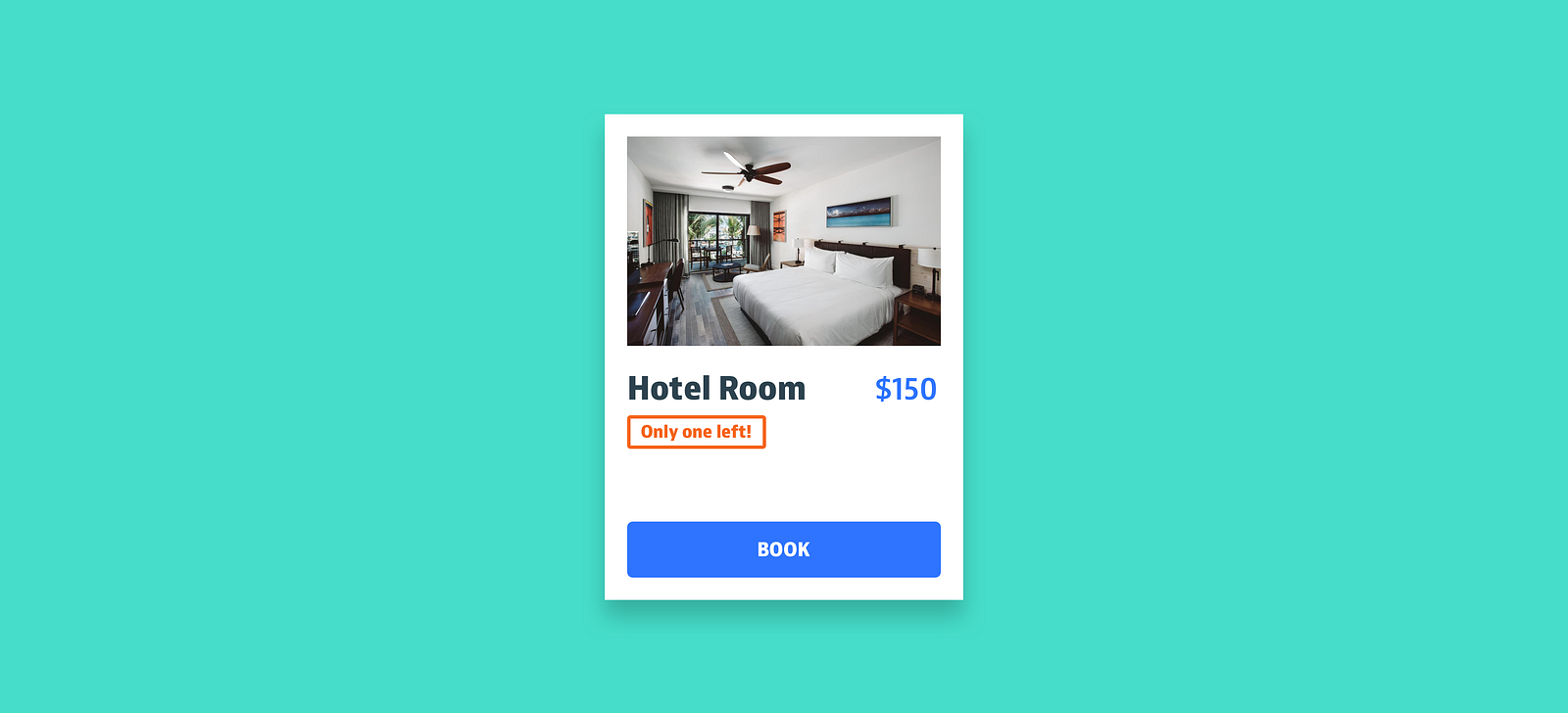
When facing a decision, we anticipate not only the events but also the associated regret we might experience. Deciding to act now is our attempt to try and eliminate that possibility.
It comes in different forms
Even though scarcity can be applied to unquantifiable features like quality or experiences, its effect is much more powerful when assessing measurable resources like objects or places. It’s the reason the likes of Amazon and Booking.com embrace it and use it extensively.
Based on these measurable resources, there are 3 main forms of scarcity:
1. Time-limited scarcity
When time has a limit, it creates a deadline that makes people act before the time is up. When the deadline is unknown, people are not certain that they can get the object anymore unless they act now, which increases the pressure but shows lack of empathy from a UX standpoint.
Examples:
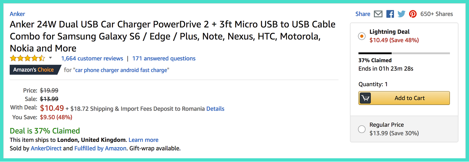
Lightning Deals on Amazon: Good
They last a few hours and show the deadline. They are accompanied by the percentage claimed by other people to highlight the urgency.
Courses on Interaction Design Foundation: Smart
Present the time until enrolment ends. Fully booked courses are still displayed to show people what it’s like to miss the opportunity.

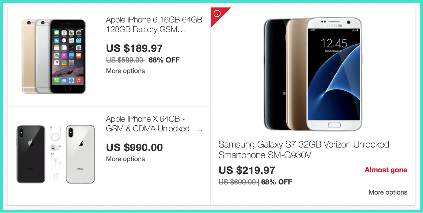
Buying things on eBay: Bad
Time limited products are marked with a red icon and a vague “Almost gone” tag. Not showing when the offer ends is unthoughtful and manipulative.
Searching places on Airbnb: Fair
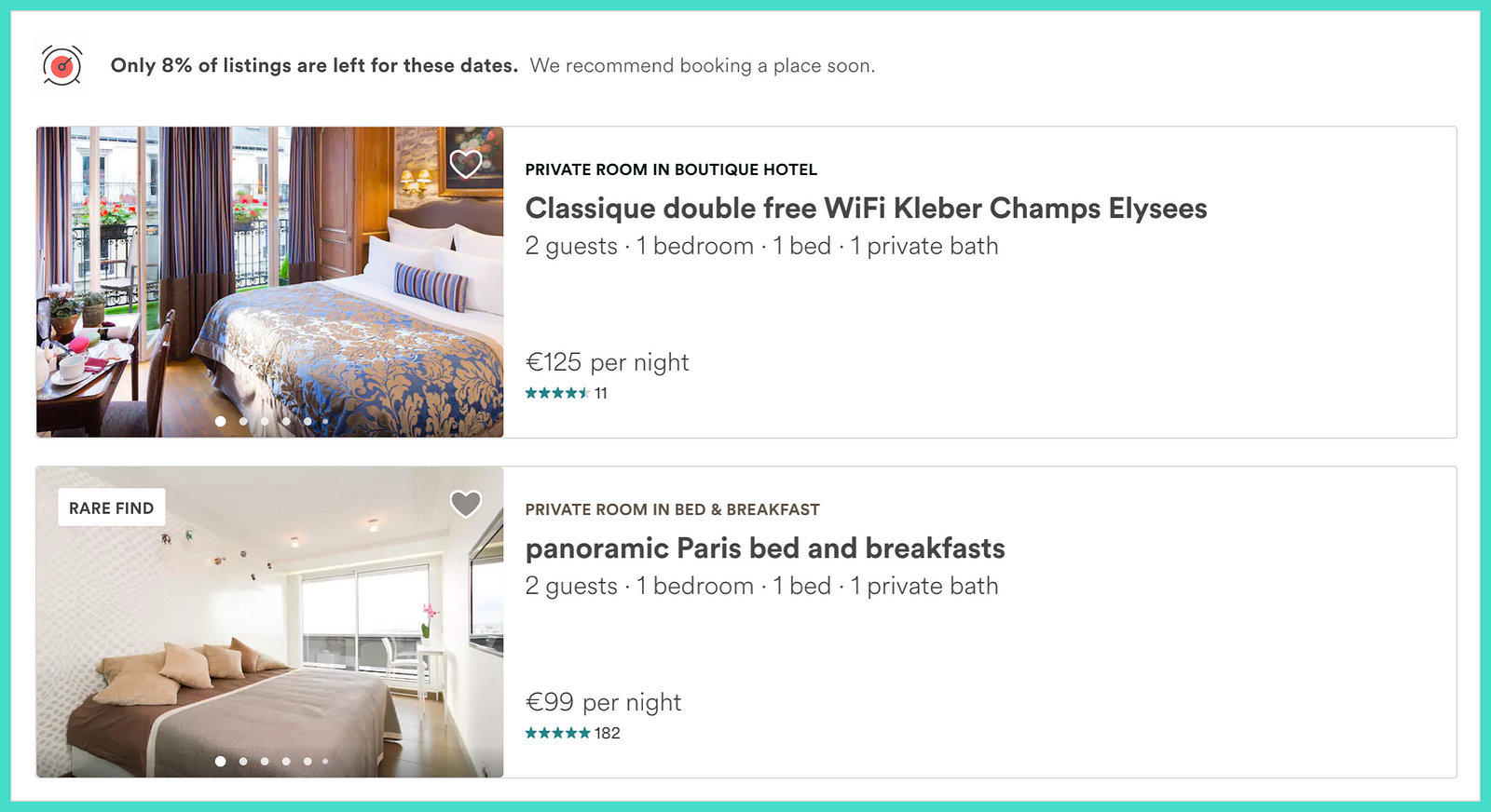
It shows people how limited the offer is by displaying the low percentage of listings left and a “Rare find” tag to make them feel lucky about their search.
2. Quantity-limited scarcity
Limited or rare supplies are perceived by people as a threat to their freedom of choice, triggering a reaction to fight the threat and maintain their access to the resource.
Quantity-limited scarcity is considered more effective than time-limited scarcity because the end of the supply is unpredictable, depending exclusively on demand rather than time.
Examples:
Looking for hotels on Booking.com: Impressive
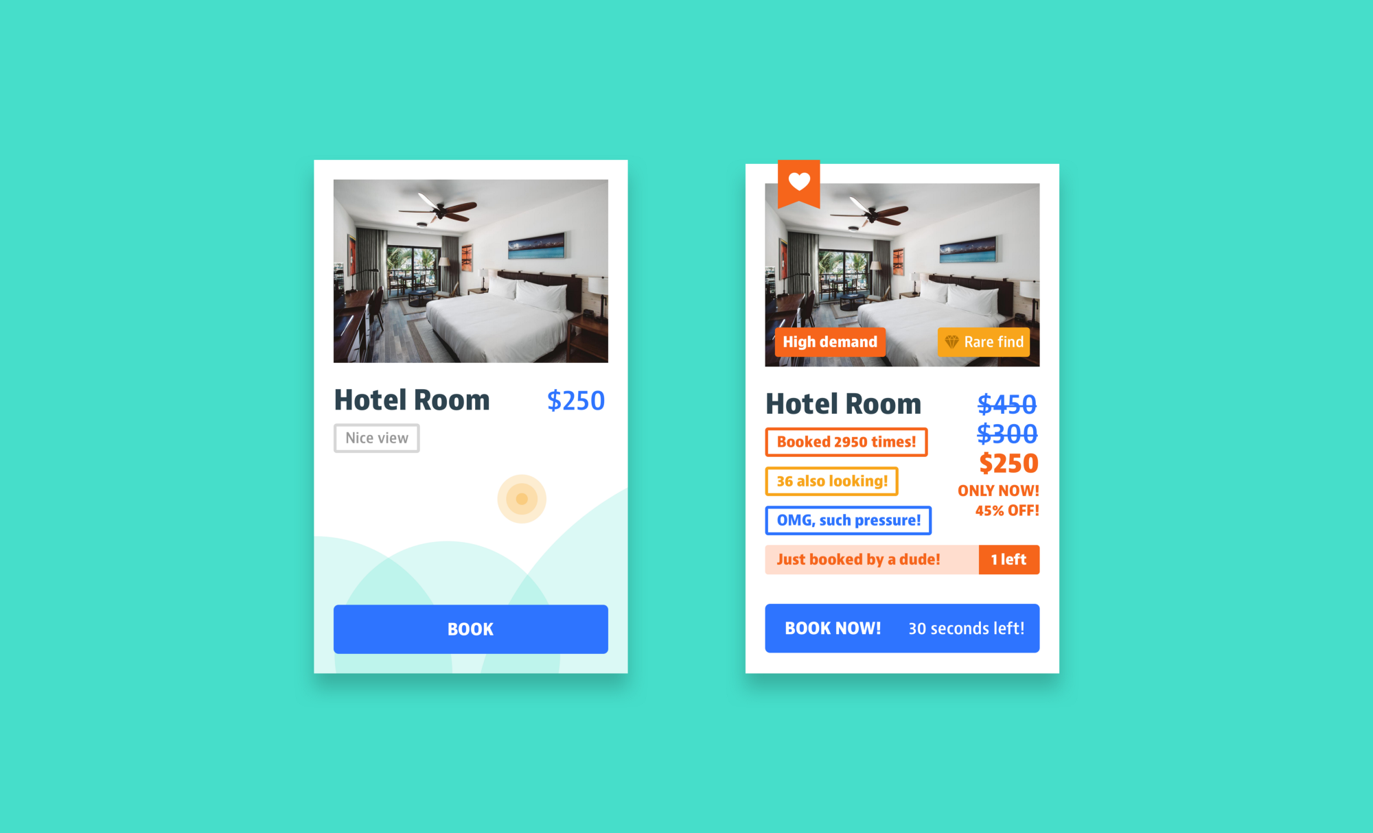
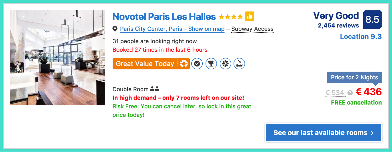
Booking is the Usain Bolt of scarcity and probably owe much of their success to it. They show the number of rooms left but also a ton of tags and labels that make you feel you’re about to make the deal of your life.
It’s smart how they use the massive data they have and, even though everything is pretty overwhelming, the information is useful.
Booking flights on Ryan Air: Good
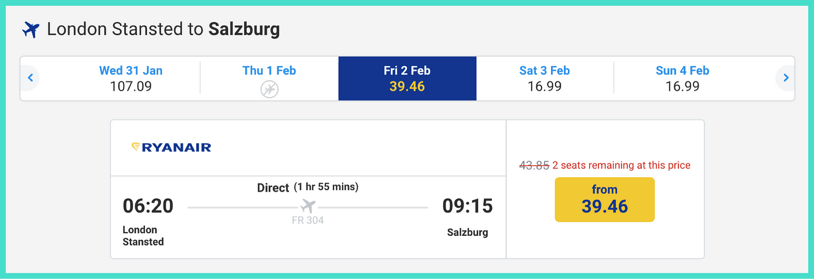
They take advantage of the fact that cheaper seats sell first and use this to highlight the limited number of seats left for the lowest price.
Buying clothes on Selfridges: Subtle
Product details display both the available and unavailable sizes. This way, it makes the available ones feel more scarce. Subtle and useful as some people are between sizes.

3. Access-limited scarcity
It refers to limited access to features like information, groups or spaces. Research showed that censorship made people place a higher value on the restricted features than those that were not because exclusivity made them feel special.
