BY Tubik Studio
Animation in user interfaces has been an issue of hot debates for several years so far. It’s especially active in the domain of conceptual animation for user interfaces. It offers creative experiments and pushes the limits of UI motion.
Here in Tubik we have already shared articles about UI animation and its benefits for apps and website. Today, let’s continue the theme considering how conceptual animation influences product success together with Tubik motion designer Kirill Yerokhin.
What is Conceptual Animation?
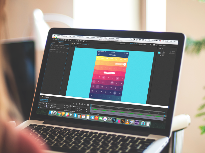
Conceptual animation is a field of concept art. It is a piece of motion design that is created to convey a particular idea before it is put into a real product. In user interfaces design, conceptual animation may be found in various concepts for interactions, transitions, manipulations with controls, animation marking the feedback from the system etc. Motion designers use a variety of tools among which we could mention Adobe After Effects, Principle, Figma and InVision.
Why Is Conceptual Animation Needed in UI Design?
This is a kind of controversial issue today. Conceptual animation steps aside from the ready-made solutions and well-checked approaches trying the ways to go beyond the limits and rules. Animation of this kind may seem unreal, needless or impossible for technical realization.
The point is that both static design (glyphs, icons, changing color and shape of controls or interface as a whole) and animation of UI present the way to make an application stand out from the crowd of similar applications which sometimes look like clones.
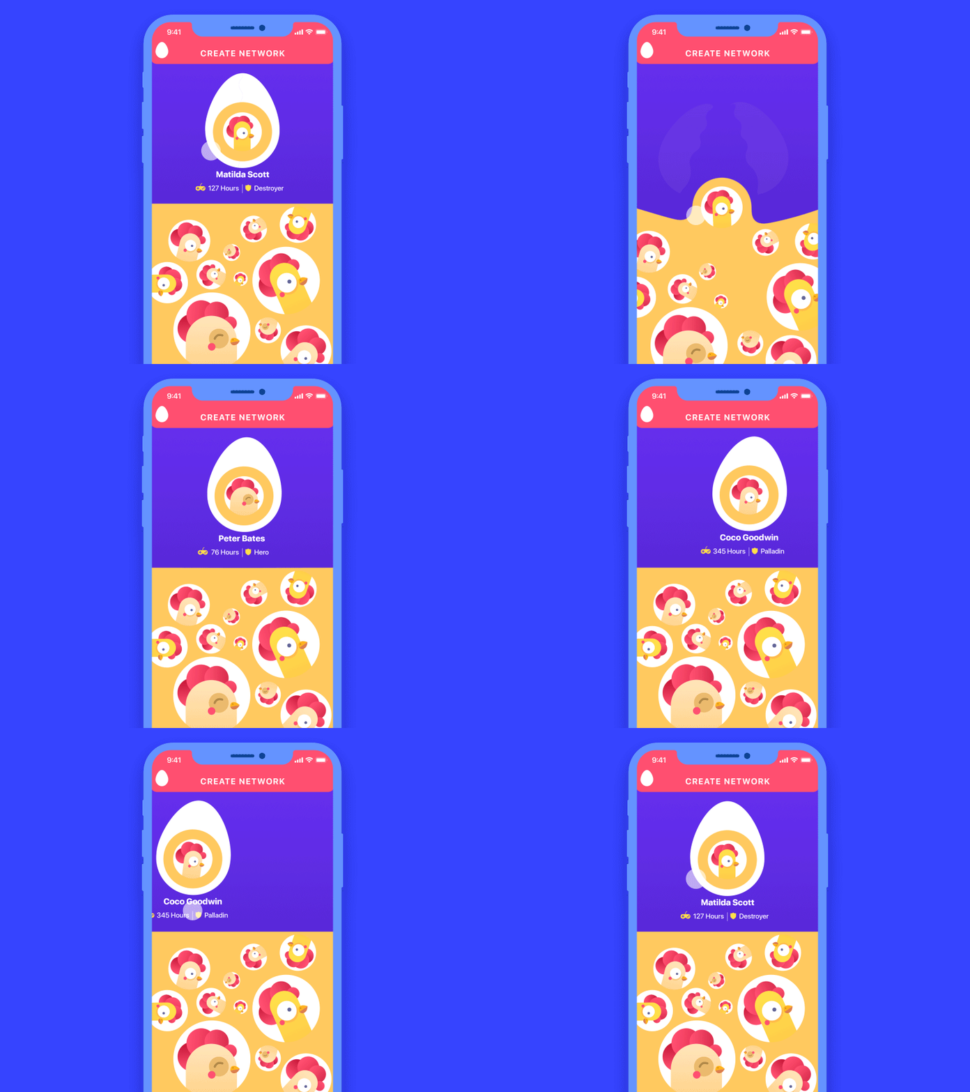
The statement that all the developers hate conceptual animation and never want to work on its realization is not true. In design it depends. Actually, as well as in other creative spheres where innovations are met with disbelief by some people saying it’s impossible to make. While the others do their best and find the new ways and approaches letting people solve new problems.
Demand determines supply. As soon as the “market” sees a fresh design concept, animation in particular, there are the ones who will seek for the ways to make it real and use it in the real world. At this moment the product of designer’s thought stops being just a concept. Here in Tubik, we had numerous cases when conceptual interface animations, even quite complex ones, were successfully coded by third-party developers.
Practice shows that on the technical side of the issue, the realization of the conceptual animation is a question of time to spend rather than the general existence of such a possibility.
Examples of UI Animation Concepts
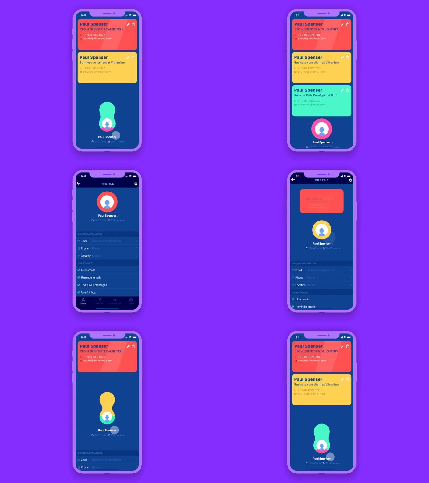
Scrolling a list of items
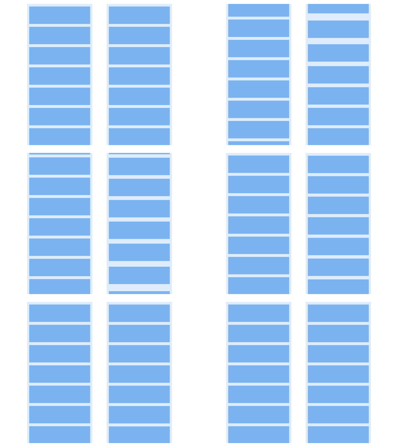
The first example features interaction with a list of items: while the left variant just moves all the list up, the right one imitates pulling the cards with a little holdback. The second variant looks lively and adds a bit of fun to the scrolling process. Another interesting thing is that the right concept creates a visual illusion of more space between the cards which supports the feeling of more air in the interface.
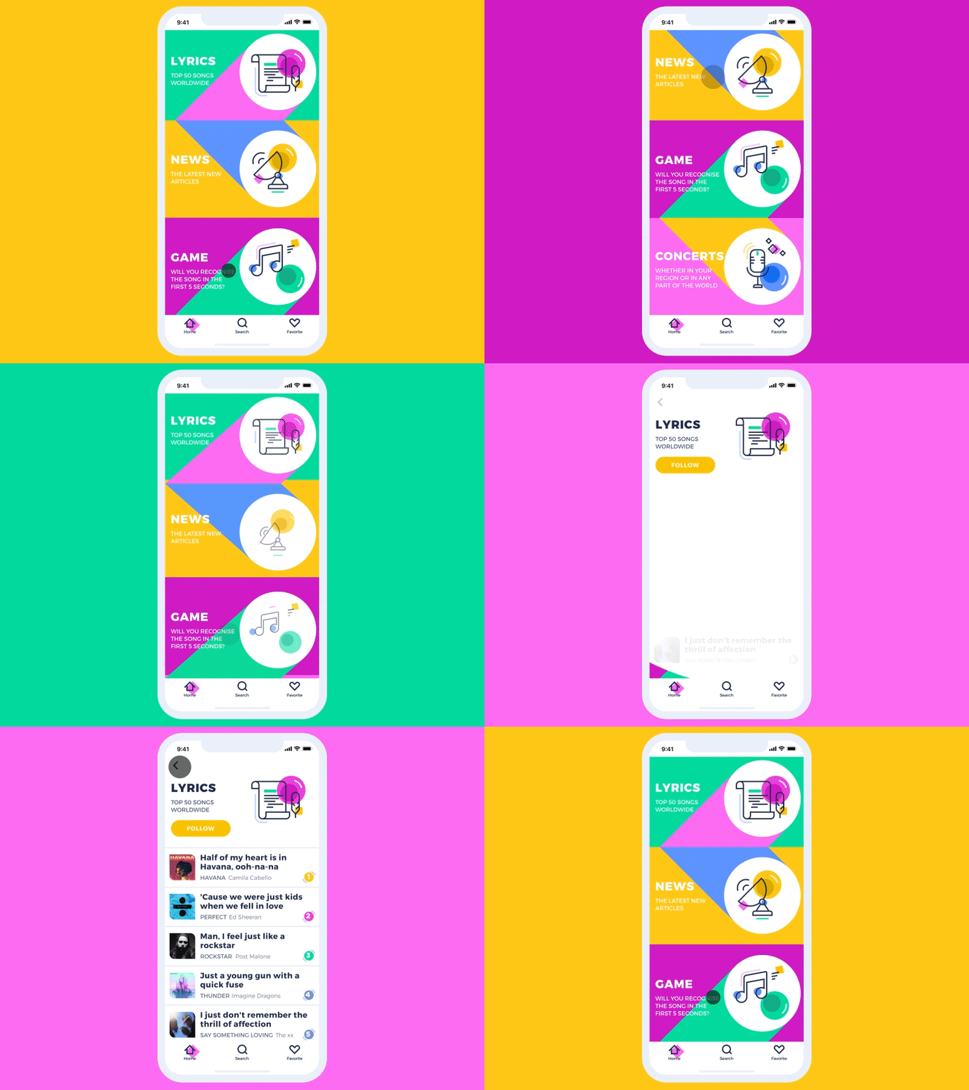
Transition from the list to the item
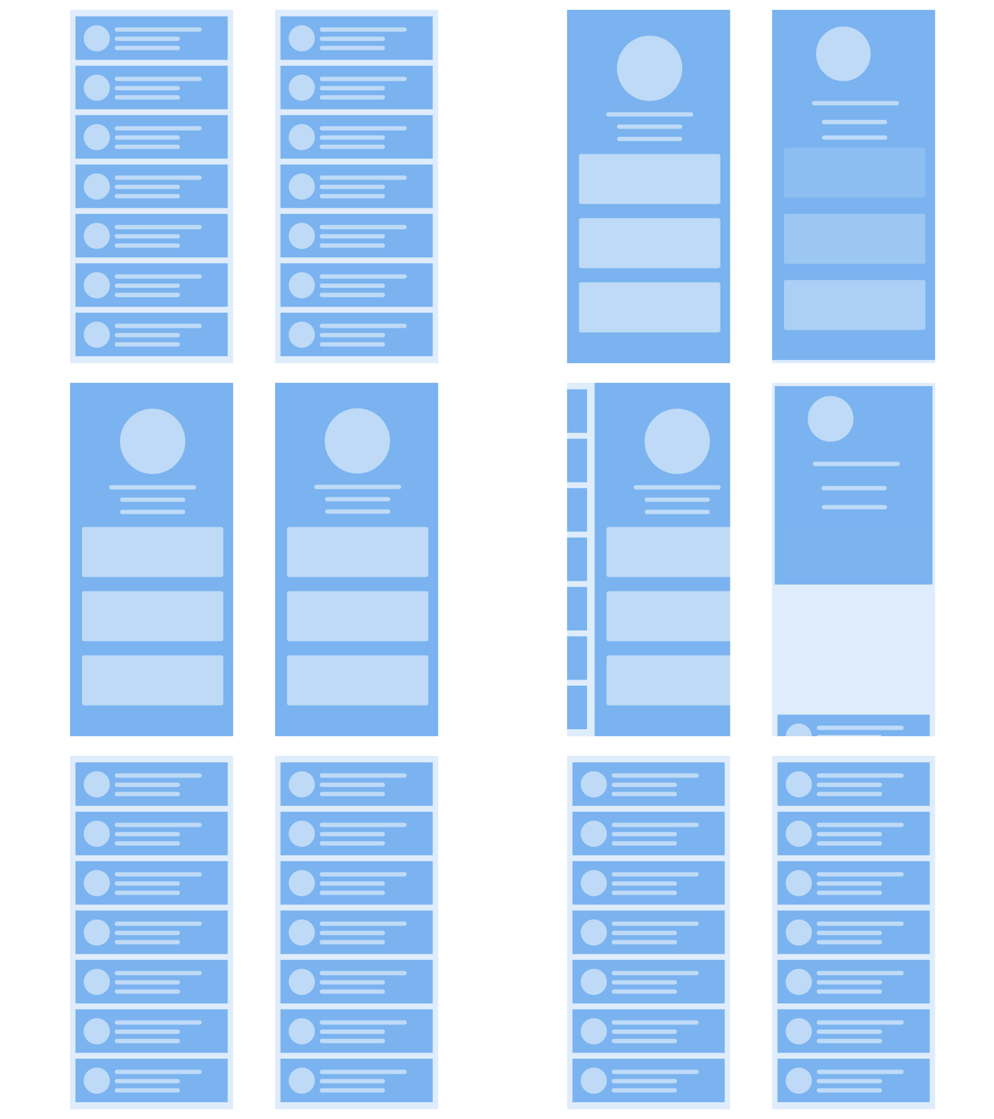
Here’s another example: the left option shows the basic way of transition from the list or menu to a particular item screen while the right one adds dynamics to the process.
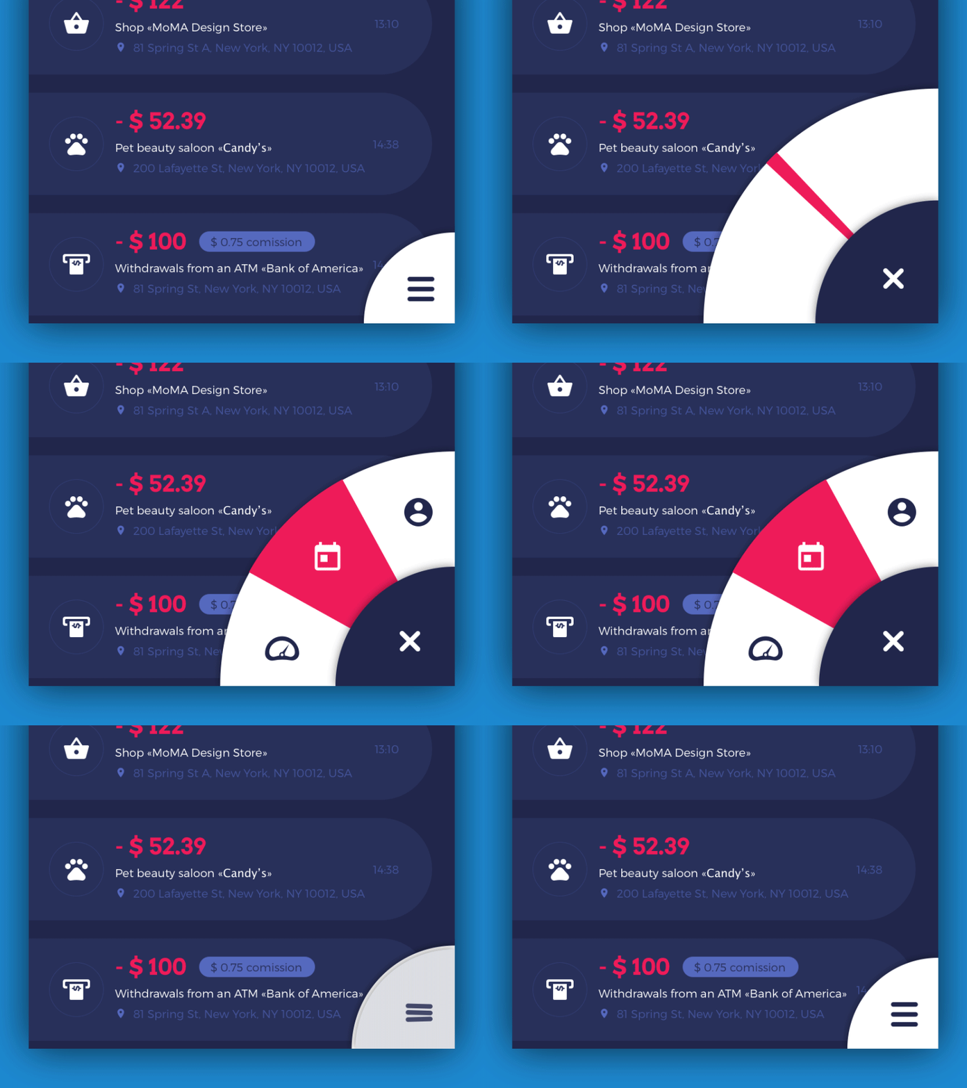
Opening side menu
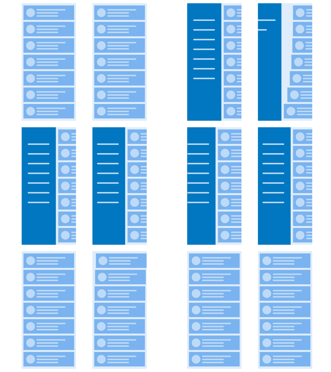
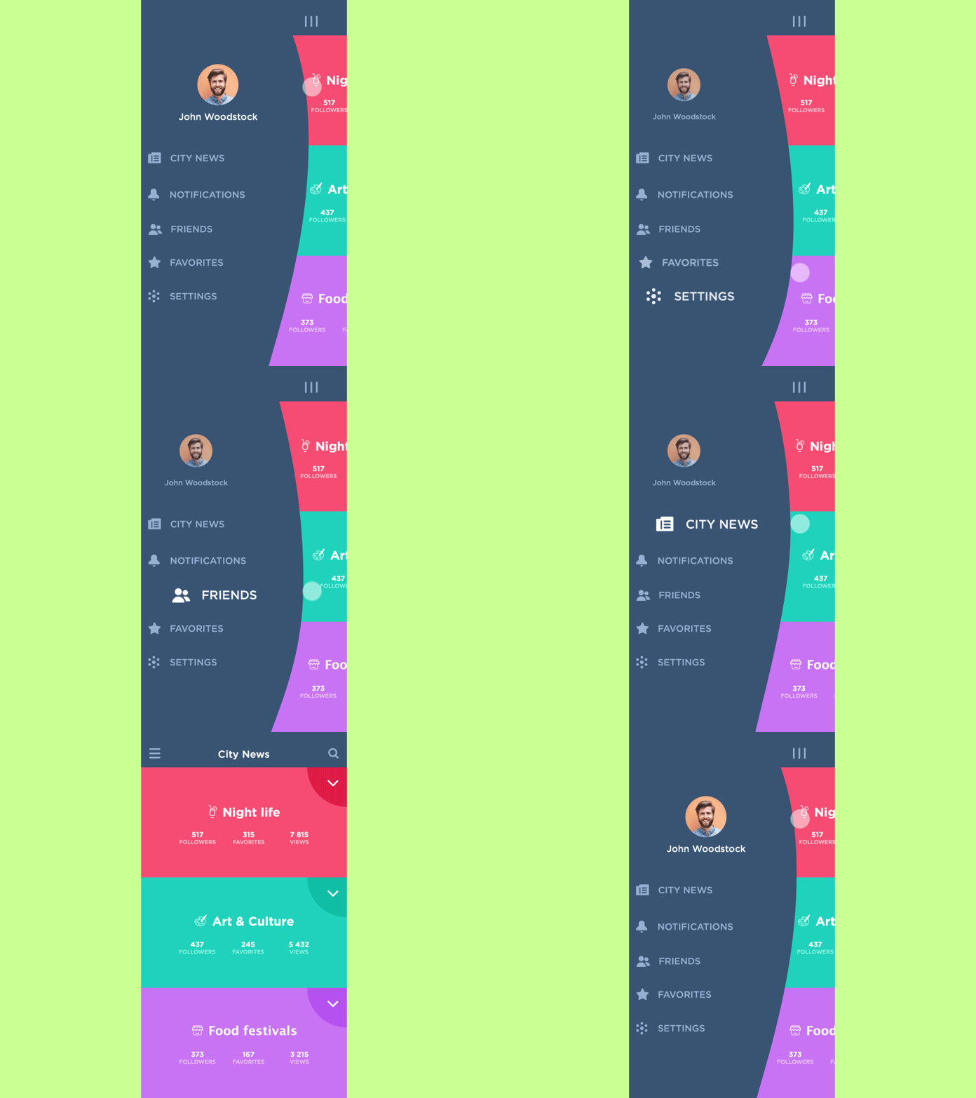
A conceptual animation may also add life and dynamics to such a basic operation as opening side menu. Using a gradual flow of featuring the objects, the designer makes the process look more elegant.
UI Animation Concepts in Realistic Interfaces
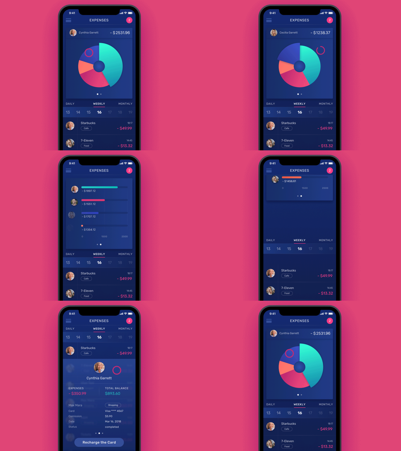
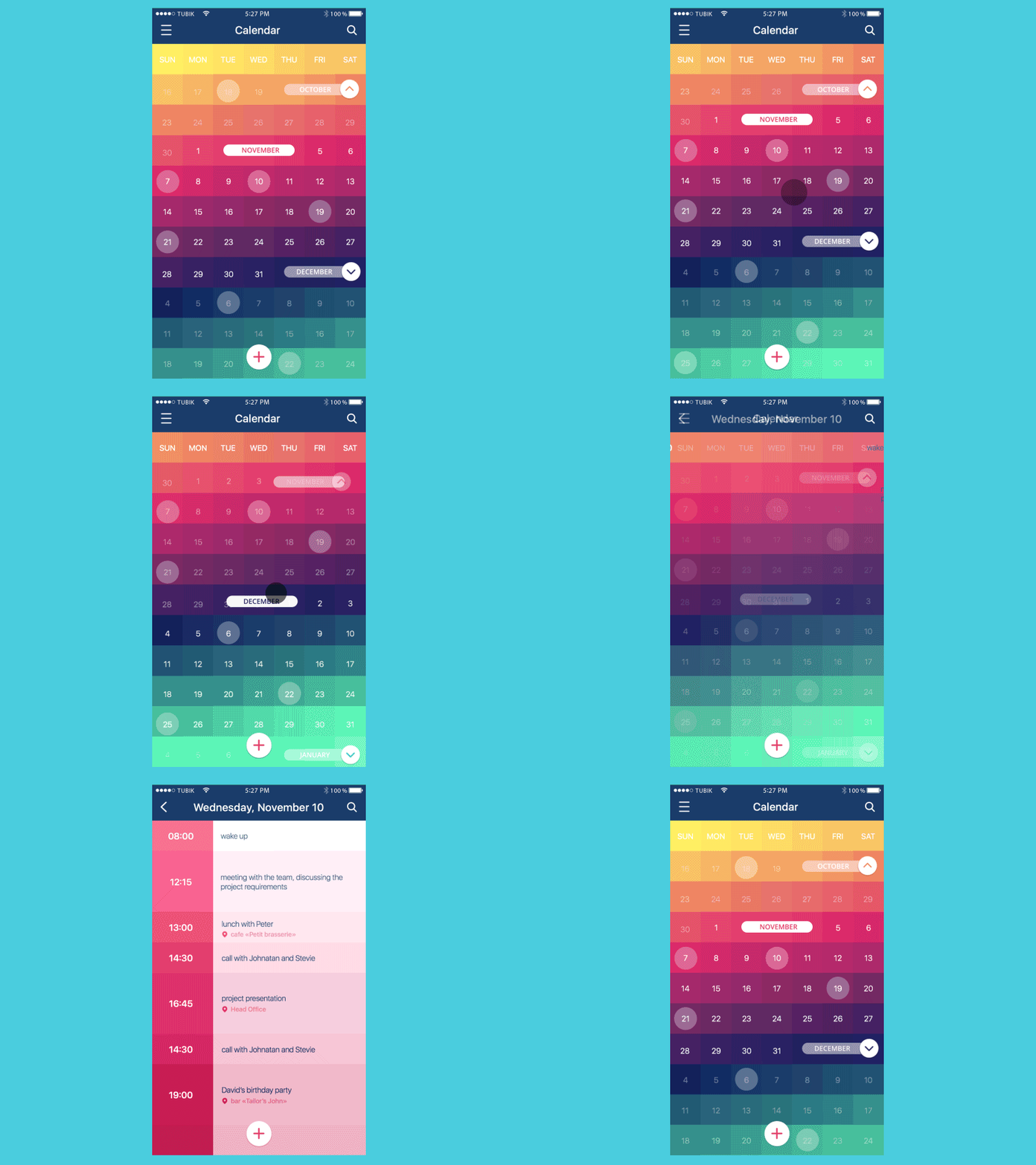
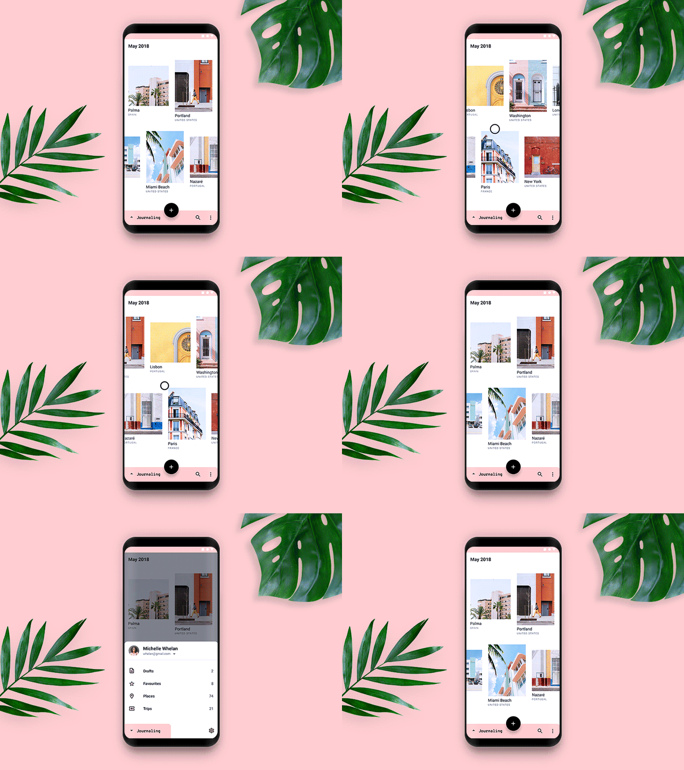
Conceptual animation is one of the creative stages of user interface design: motion designer may offer different options to discuss with clients and developers. Here are some examples worked out by Kirill together with UI designers.
