BY Alexander Handley
What do user flows have to do with wireframes? Wait… there’s different types of user flows? Continue on my dear reader…
Am I going to be being (overly) dramatic — no way! (Yes).
Am I (probably) biased—you bet.
But do you have an informative, opinionated article in front of you which will add a tool to your designer tool-belt—yeah sure why not!
Contents
- 📚 A quick definition of user flows
- 🖥 What role do wireframes have?
— What do wireframes have to do with user flows? - 🔍 What are the different ‘resolutions’ for user flows?
- 🤔 FAQ: Frequently Anticipated Questions
— a cool gif
And if that doesn’t entice you to read to the end my busy skim-reading friend then here is my Code of Content which I promise to abide by ✋
📚 A quick definition of user flows
First of all, a quick definition for the uninitiated:
A user flow is a series of steps a user takes to achieve a meaningful goal.
In this article we’re going to learn how the rise of user flows will have a similar impact on product teams as wireframes.
What’s so great about wireframes anyway?
🖥 What role do wireframes have?
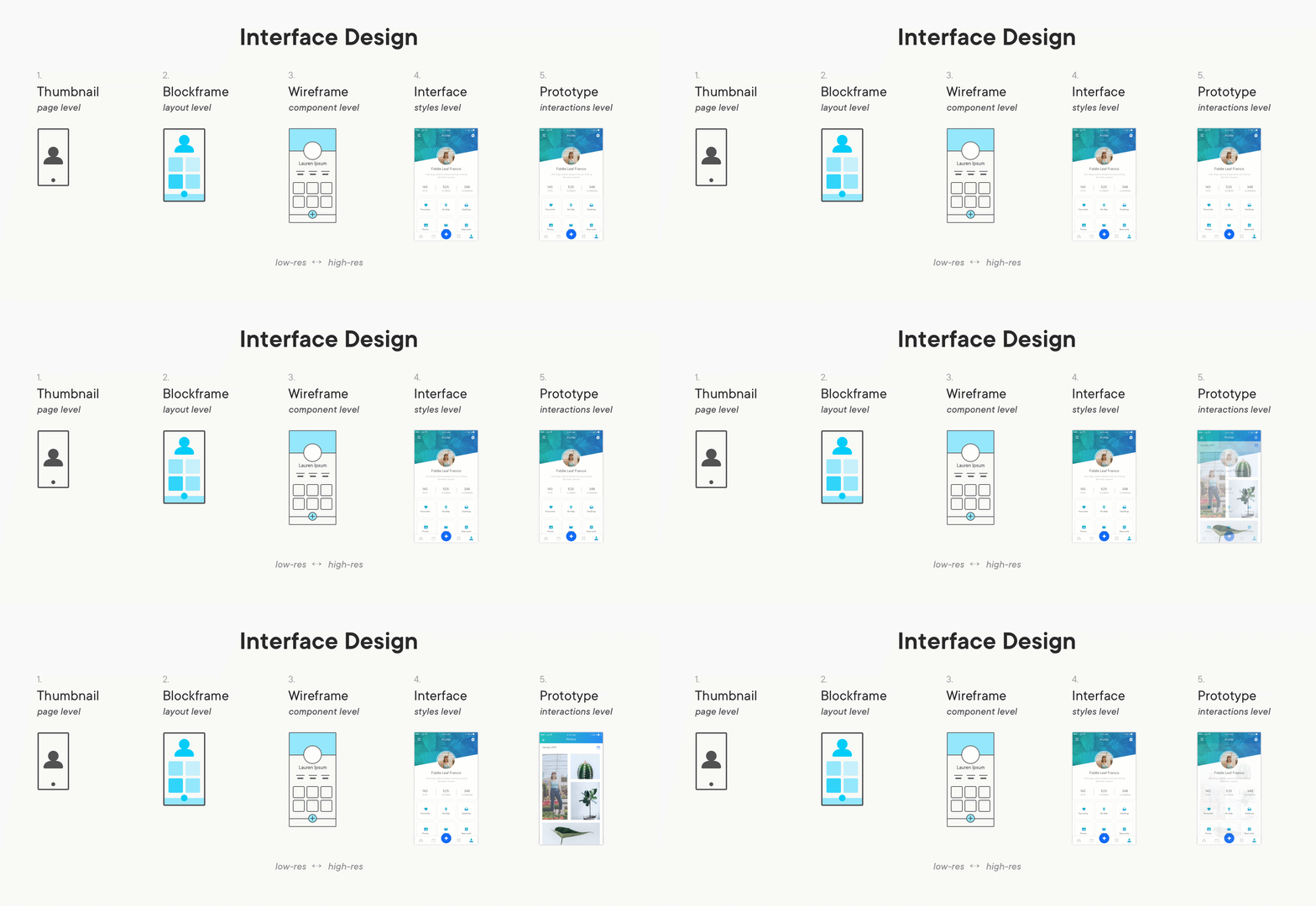
Wireframes were a great invention that will go down in the records of design. My use of wireframes also stretches to cover: low-fi mockups, blockframes, interfacemonos, and wires (one of those is made-up).
I’ll be painting with broad brushstrokes here:
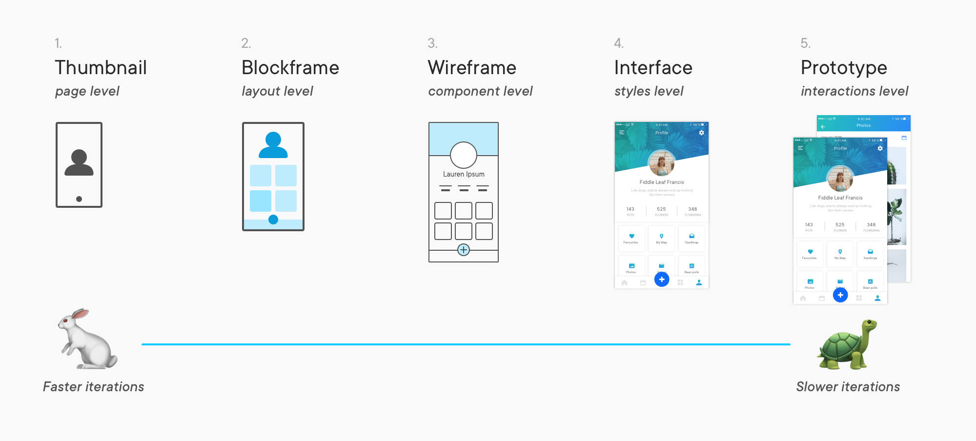
1. Faster iterations
Wireframes give designers—and non-designers—a way to iterate faster through ideas. As explained by emojis:
2. Better communication
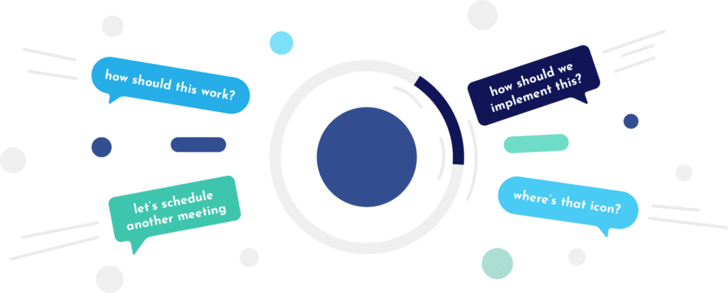
I love how wireframes give us something to keep the discussion about the design itself; without requiring a crisp pixel-perfect interface.
With wireframes the process has shifted from situations like this:
Hey developer I need you to code something that looks exactly like this mockup I did in PowerPoint.
– Eager Founder
To more like this:
Here’s an idea how the interface could look, but I’ll put it in front of some users first.
And in an infographic for our skim-reading peers:
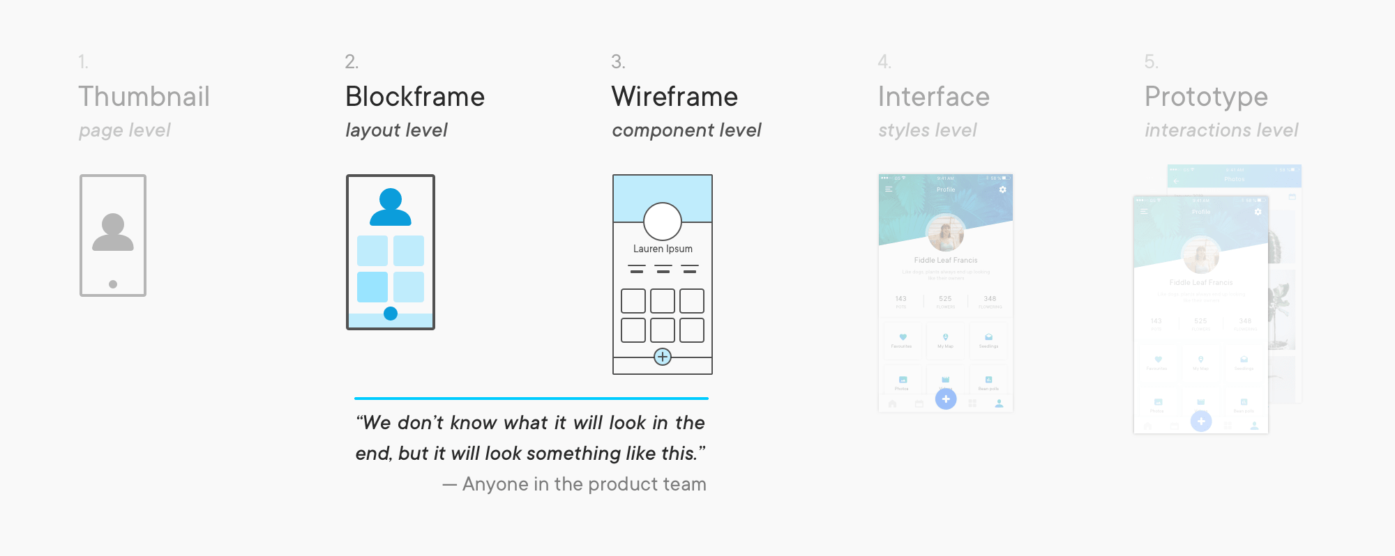
I’m not doing wireframes and prototyping justice! You should follow uxdesign.cc religiously 🙏 they’ll do a better job at covering the topic.
— So what do wireframes have to do with user flows?
They have a lot in common! They both have different levels of ‘resolution’ and fidelity of the finished product. When used at the right time in projects they can both:
- Increase the speed of iterations
- Improve communication across the product team
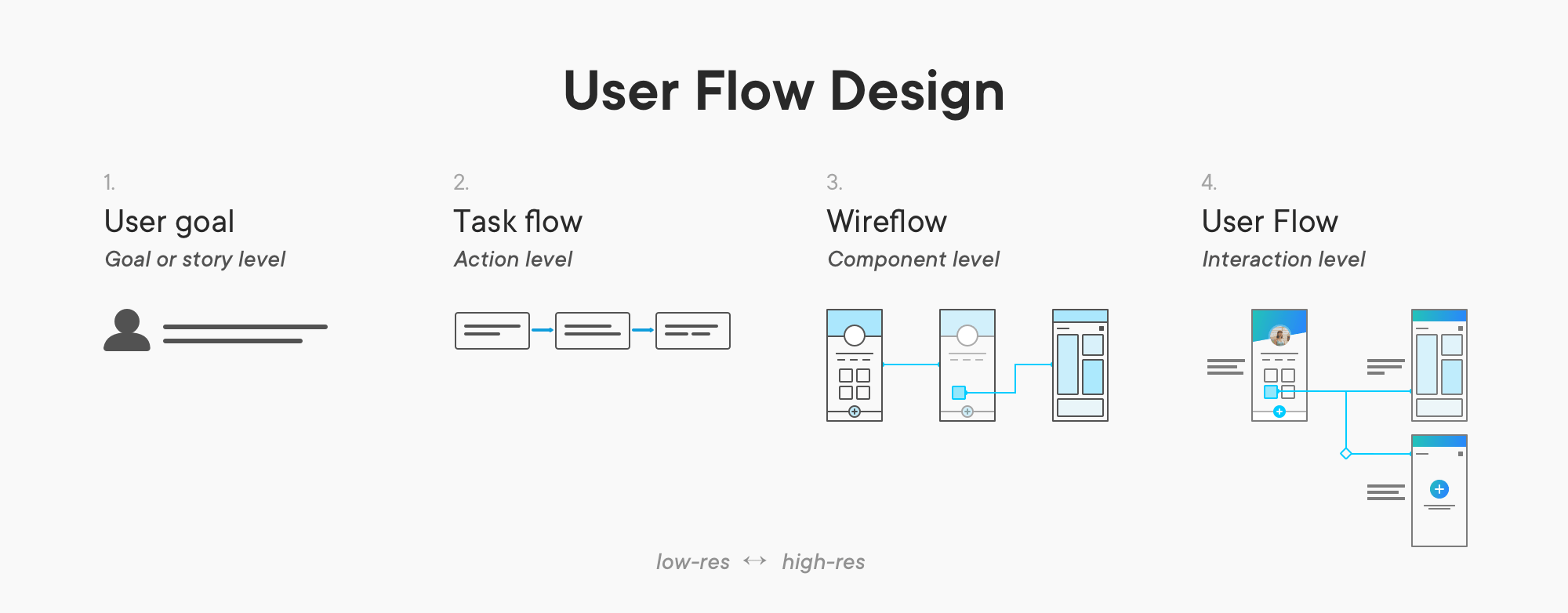
Let’s step through the different ‘resolutions’ of user flows.
🔍 What are the different ‘resolutions’ for user flows?
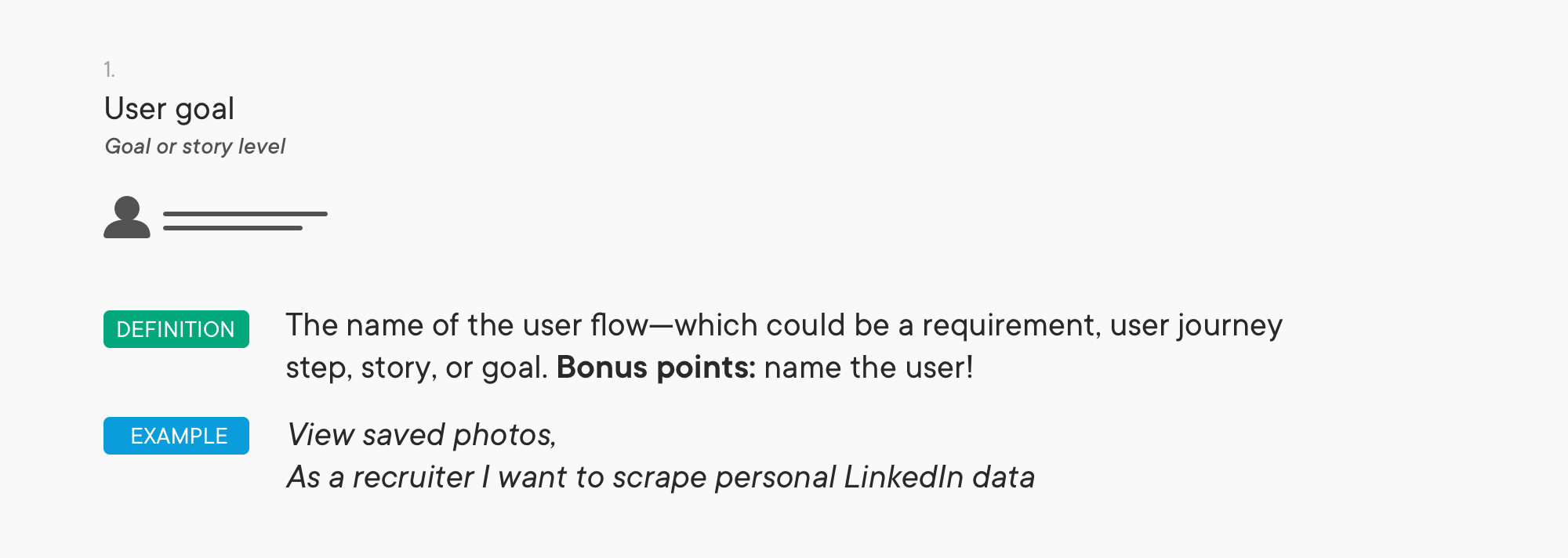
That’s not a user flow! I know—but it’s a solid start. A definition of the flow you are designing is what separates it from a sitemap or process map.
I like to define the user and their goal, but you could use a requirement, story, stage of a user journey, or step on their quest to Mordor. Anything that fits neatly into a little draggable card right? 🙃
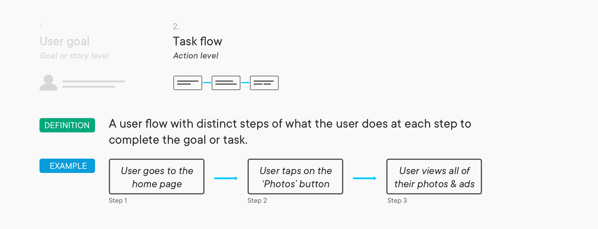
Make your users the ⭐️ of your flows. Describe what they will do at each step. A good way to get started is to write out what the user needs to do at each step to get the job done or meet the goal/requirement.
Personally, I don’t find it helpful to include the desired emotional state of our users at each step… I mean are you 😃 🤔 🐶 or 😠 while you “Update Billing Settings”.
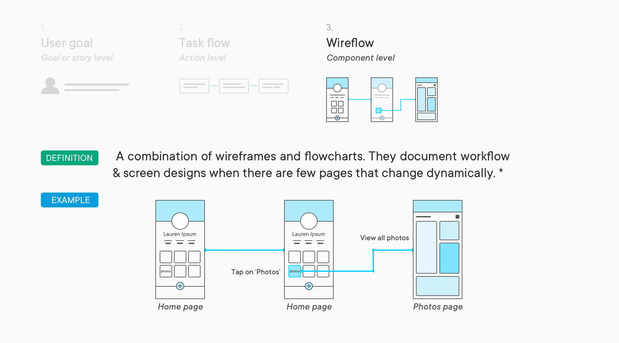
The wireflow (or visual user flow) stage is the next level of commitment for your flows 💍. At this resolution you can start adding in what digital things your users will stare at/use: screens, messages, unwanted lobby advertising displays etc..
Our pal the wireframe works well here. But so does an icon labelled after the screen it represents. Keep the conversation on the flow not the screen.
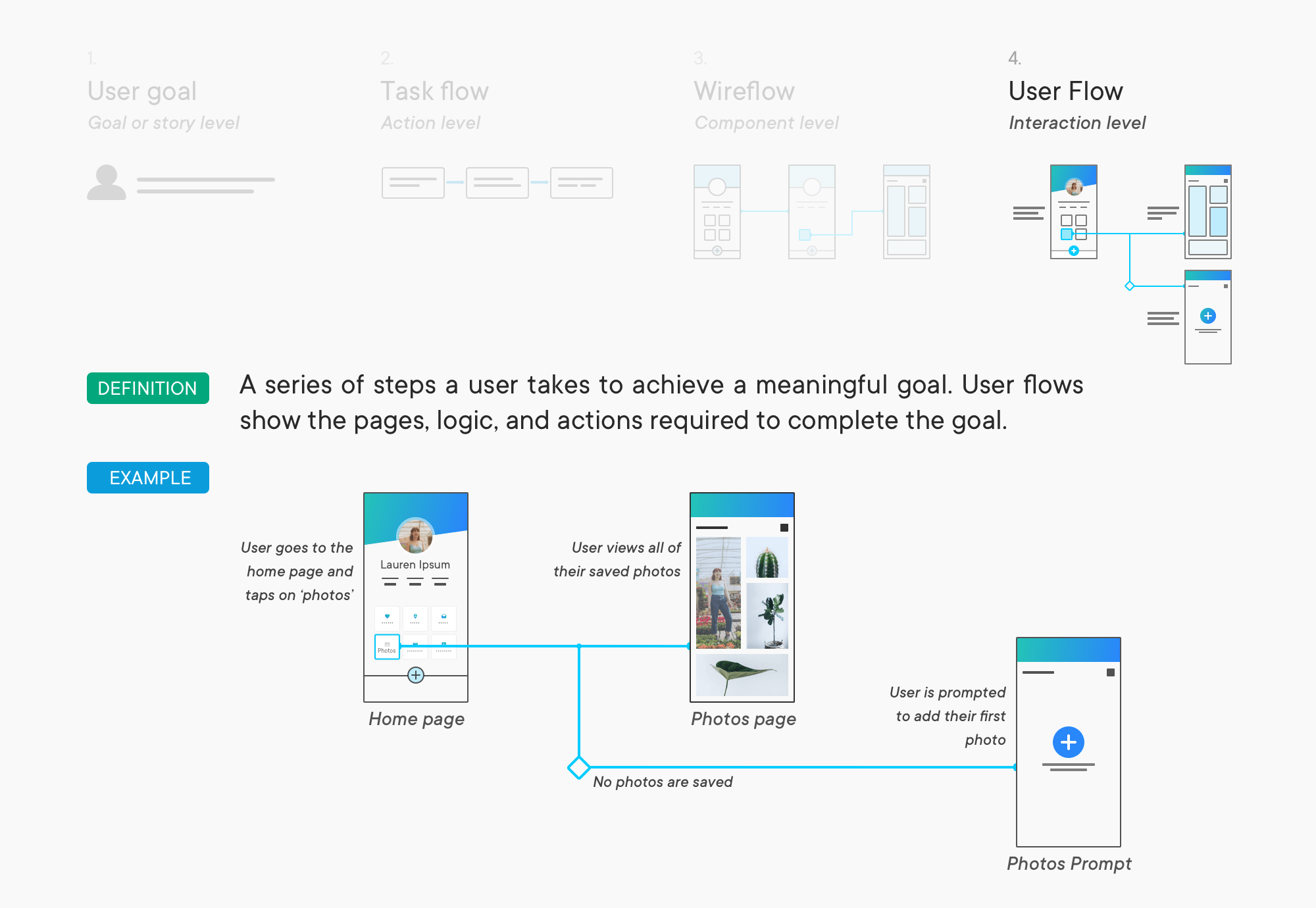
The goal at this stage is have a user flow that both your users and developers will understand—otherwise you end up with a solution that neither understands.
To get to this stage from wireframes, think about all of the information required to create the flow:
🤔 What happens when things don’t follow the ‘happy path’?
🤔 What logic or case leads to an alternate path?
🤔 Is there any data being moved around? (And am I accidentally 😉 using it to chase my users around the internet with ads)
🤔 Any state changes in your interfaces? What triggered them?
All together now for the TL;DR crowd!
🤔 FAQ: Frequently Anticipated Questions
If I didn’t hit a question you had, comment it below!
How do I add this to my current [_____] UI process, that fits in with the [_____] quadrant of UX [_____] in design, and still work with the [____] flavour of [_____] that the development team configured Jira for?
Take it easy. I think user flows work best when they’re used as a tool to communicate your designs through the lens of your users’ goals. You can then go from there with however you see fit.
What tool can I use for this? Do they have branded socks?
Great first question. There’s a lot of solid tools in the space: Flowmappcombines sitemaps and user flows, Overflow makes wireflows fun and quick to build, Invision has freehand of course, Marvel generates user flow from their prototypes, and a shout-out to the home-team Primary which focuses on low and hi-res user flows.
Don’t forget pen + paper and whiteboards!
