BY Eugen Eşanu
When it comes to designing products in the 21st century, we tend to believe that there are new rules that must be learned. Fortunately, that’s not true. Why? Because humans are the same and our behavior changes slowly. Only the environment we live in is different. And with that, some basic design principles will never change. Here are 7 more product design expectations vs reality cases we can see or be part of on a daily basis. This article is a continuation of my previous one — Product Design: Expectations vs Reality

To build great products, teams must be small
As mentioned in my previous article companies like Nike have shown a great example to world on how people can keep the teams small (3 people) and create products that can be a game changer. Keeping your team small, mainly made out of 2–3 decision makers, can be a great factor of success.
The more people involved in a process the less likely it is, in my experience, for the end result to be distinctive. “Committees” are not conductive to original work. As the comedian Allan Sherman said:
They sit there in committees day after day, and they each put in a colour and it comes out gray.
It’s, of course, challenging to build new products or features in a team of two to three, but that’s the beauty of constraints. There’s a widespread myth that to get a better picture you need a larger canvas. Yet every creative knows this to be untrue. Too much freedom can lead to mediocrity. Because without boundaries there’s no incentive to break through them.
A real creative person, in a tiny team with few resources, will have no difficulty redefining a brief or defying convention. But give too much freedom, too many people and resources to a problem, and you’ll get a final product that is over-designed, over-worked, over-budget and under-focused. The best thing you can do is throw less at a problem.
For example, if you can’t build a V1 of your product in a team of three people, this means that either the people are not right, or the product you are trying to create is too complicated.

There is not enough time for your product
With all the content on Internet, daily tasks and other things happening in the world, there’s not enough time for a user to focus all its time and effort on small details that don’t matter to him/her. This is an important thing to keep in mind when you are thinking to add that extra layer of complexity to your product. That extra delight that nobody is going to notice. Rather than focusing on actually being great at doing one thing.
Life is a much more stressful and demanding environment than an app’s delights and subtle effects.
For most of the people, it is not essential to know or understand how your product works. Not because they are not intelligent, but merely because they do not care. So once they nail down the use of your product, they will rarely switch to something else.

Building features vs solving business problems
What should our product team work on today? The answer is usually on your product roadmap. It contains a list of features, ideas, tasks to do, small and significant projects and multi-team efforts that must be achieved. Along with that, all of them have a deadline. So everyone can grab a task from the roadmap and not worry about what to do next. This means we can define a roadmap as:
The product roadmap is a prioritised list of features and projects with an end date.
But the problem lies in the fact that roadmaps are the cause of most waste and failed efforts in product organisations. They are a graveyard for more than half of listed features and ideas that will never succeed.
The problem with roadmaps is that we put on it features to build, but it should have business problems to solve. What is the underlying problem? And not just deliver a feature — Marty Cagan
How can we have better roadmaps? Before committing to anything, add a discovery stage. I would like to make it clear that the problem lies in committing too early to a goal before you even established any business objectives. People make commitments before they even know if this is something they could deliver, and most important, will it solve the customer’s problem.
Having a list of features to add with a deadline is important, but is it a real problem to solve now? Will this feature bring us closer to our end goal or vision? Will this product release add anything of value to our end user?

Living the life of an user
We hide so much behind some self imposed processes that we forget to get out and test our products in the wild. Live the life of our users to be able to see clearly what needs to be improved or added. Rather than sit and discuss fictional visions in a meeting room, you can leave the screen and search for your product answers out in the real world with your users.
What do they feel about your product? How do they use? Have you seen the environment yourself? What issues do they have on a daily basis that might interfere with your product? The answer to these questions can’t be found online.
Nassim Taleb has an interesting idea — he noticed and wrote about it in his book “Skin in The Game”. “Those who give lectures to large audiences — and other speakers — feel uncomfortable on stage. The reason, it took me a decade to figure out, is that the stage light beaming in our eyes hinders our concentration. (This is how police interrogations used to be run: beam light on the suspect, and wait for him to start talking.) But in the middle of the lecture, speakers can’t identify what is wrong, so they attribute their loss of concentrations for being on a stage. So why is this happening?”
It’s because light engineers don’t lecture to large audiences, but those who lecture don’t know anything about light engineering.

Design around human flaws
It is funny how with all the progress and all “time saving” application we spend almost the same amount of time as before them. Sometimes even more, due to interface difficulties. Most of the errors or unnecessary steps during a decision process of a user appear only because we treat humans as machines (logical) rather than as human beings. This ends up requiring from people to behave in a computer like fashion.
We require from people to do repeated operations with extreme precision, which machines are supposed to do and we are not so good at. We expect from people to monitor alerts and other trivial and small stuff, which means being alert for long periods, something we are bad at. And when we fail, we are blamed for that — Don Norman
We should not think of “human error” as something wrong. But more of something we are not good at or biologically suitable to do. We should eliminate the concept of error and realise that people could use assistance in translating their goals and ideas into the appropriate form of technology.

Don’t solve a problem straight away
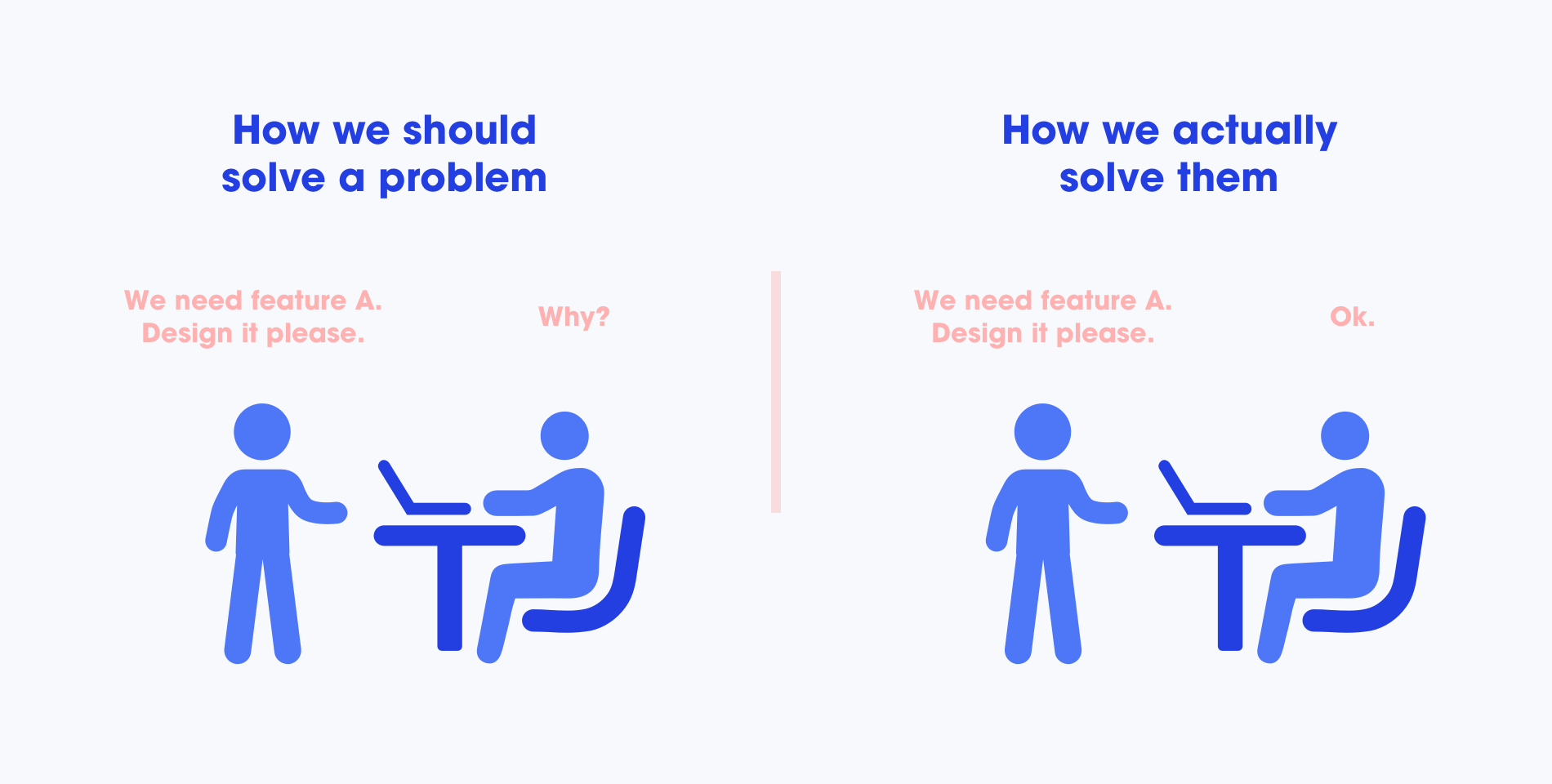
Don Norman in his book The Design of Everyday Things writes about how he never solves the problem he is asked to solve. Why? Because, invariably, the problem he is asked to solve is not the fundamental one or root problem. It is most likely a symptom.
The secret to a successful product in design is to understand what the real problem is — Don Norman
It is amazing how many people start solving a problem straight away, without questioning it. Some people with MBA’s bring in spreadsheets that show you all the analyses needed to tell you how to solve the problem in the most efficient way. Engineers bring in detailed lists of specifications and drawings. Designers fall in the same category. But then, the real question appears — “How do you know that you are solving the real problem?”
In real world, problems don’t come in nice and neat packages. They have to be discovered. It is all too easy to see only the surface problems and never dig deeper to address the real issues — Don Norman

Human behaviour does not change that fast
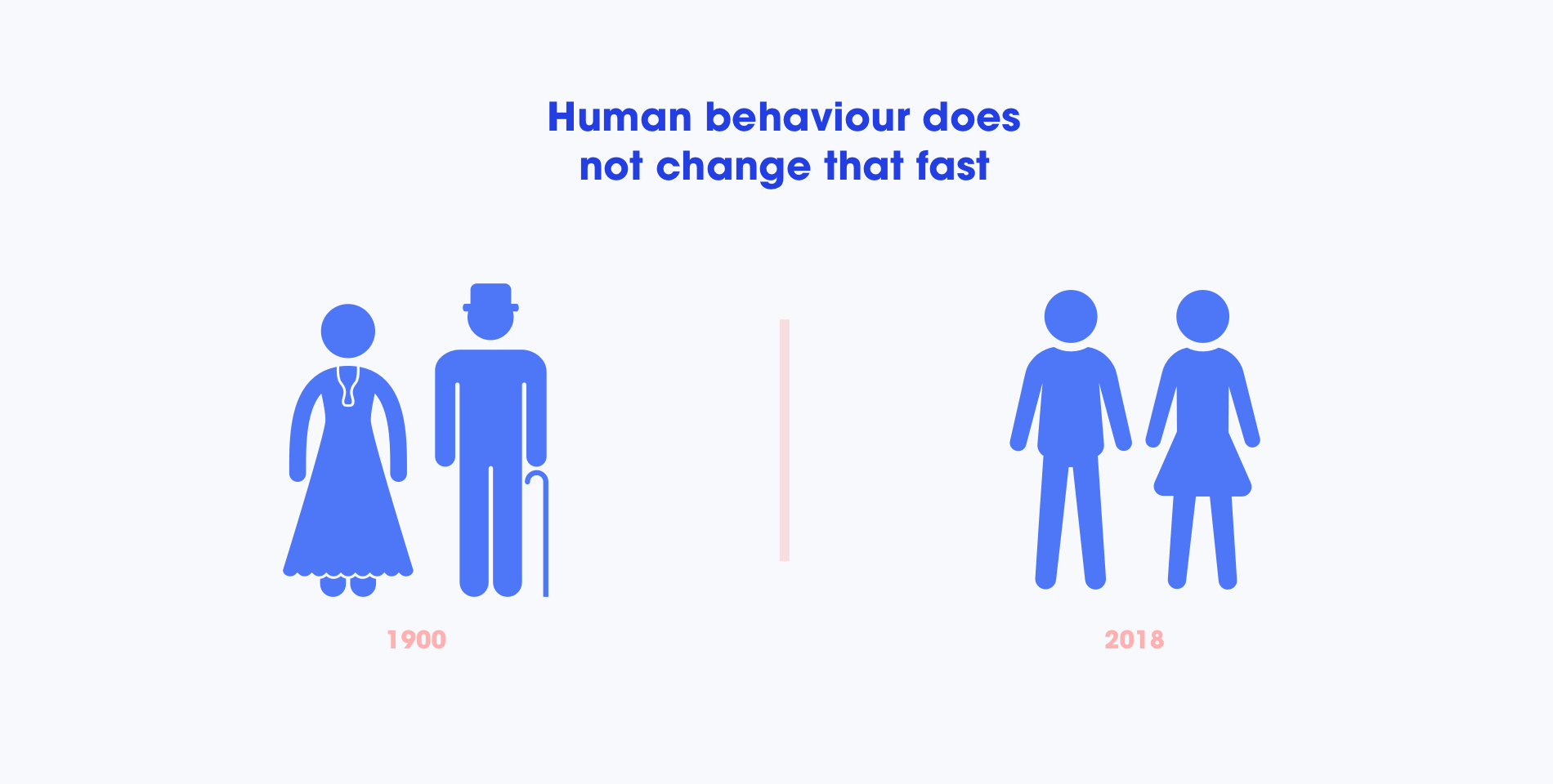
We expect that because we are in the age of the Internet and other gadgets, somehow human behaviour changed. But we forget that the human mind changes slowly, and the knowledge you have about human behaviour will not go old for at least 50 years or so.
The human brain’s capacity doesn’t change from one year to the next, so the insights from studying human behaviour have a very long shelf life. What was difficult for user twenty years ago continues to be difficult today — J. Nielsen
Technology changes rapidly, people and culture change slowly. Or as the French put it — the more things change, the more they are the same. And of course evolutionary change is always taking place, but human evolutionary change is measured in thousand of years. For example, Don Norman published his famous book the Design for Everyday Things in 1988. And republished it 2014. Even though the principles remained the same, the only thing that changed was technology. We still struggle with how many features to add or understanding customers, and I believe we will keep struggling with that. Until one day, probably.
Human-centred design is the process of ensuring that people’s needs are met, that the resulting product is understandable and usable, that it accomplishes the desired tasks, and that the experience of use is positive and enjoyable — Don Norman


