Images are a key component of every website. According to HTTP Archiveimages make up for more than 60% of data loaded on web pages. Being such a critical component of almost all websites, whether it is e-commerce, news, fashion websites, blogs or travel portals, image optimization is important, and perhaps the lowest hanging fruit, if you are looking to speed up your image heavy website.
Optimizing images on your website can be broadly divided in 3 categories — load lighter, load fewer and load faster. The 5 techniques that we discuss in this article or any other techniques that you come across would most probably fall in either of these 3 categories.
So, let’s get started and look at some simple techniques you can implement today to make significant progress on optimizing your image heavy website.
1. Resize your images
This is a must have. Resize your images to exactly what is required on your website. And no, I am not talking about resizing using CSS or in the HTML. I am talking about resizing the image on the server and then sending it to the browser.
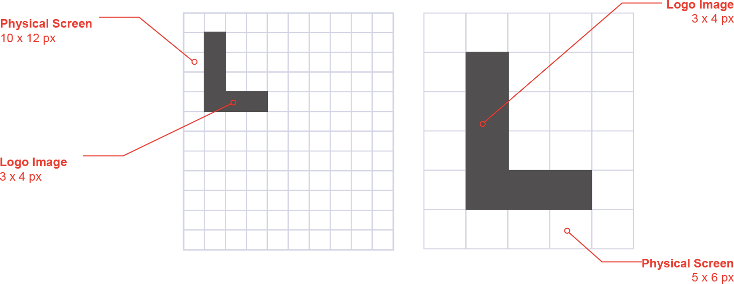
For example, you have a 4000x3000px image for a product you want to list on your e-commerce website. On your website, however, you need to show a much smaller image of this product. It could be a 200x300px image on the product listing page and a 800x1000px on the product detail page. Make sure that you scale down the original image to these dimensions BEFORE sending it to the browser. The resized images are much smaller than the original image and will load much faster than the original image.
In my opinion, incorrect resizing of images, is the biggest area of optimization on most websites. And often, we as developers, tend to overlook it. Consider the following scenario: You start out with perfectly sized images for your new website. Over the next few months, your website’s layout changes and so do your image dimension requirements. However, instead of generating new images to meet these new dimension requirements, which is quite a task in itself, you make do with a close alternative. For example, you use a 300x200px image where a 200x200pximage would have worked. I guess this would have happened with everyone.
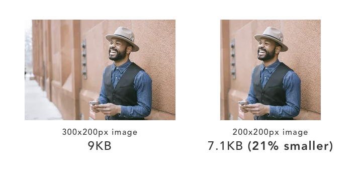
In the above example, the difference might seem small for a single image in terms of Kilobytes. But it is still 21%. This small difference, added up for a lot of images, has the potential of speeding up your website and reducing your bandwidth consumption by 21%.
The best scenario is to have an image server that can resize an image to any given dimension, in real-time, just by changing the image URL. That ways, whenever your image dimension requirement changes, all you need to get your new images is to specify that dimension in the URL.
There are many open-source and server-side implementations that you can implement on your own. ImageKit is one such third-party service which, apart from all the other features, provides real-time URL-based resizing and cropping. And you can use it on all your existing images as well in a few minutes of setup.
2. Optimize your images
The next step in speeding up your image heavy website is to choose the right format and quality for every image on your website.
JPG, PNG and GIF are the most common image formats being used currently on the web and are each suited for different use cases. There is another relatively new image format called WebP that combines the best of these image formats, is 30% smaller in size and is supported on almost 75% of the modern browsers.

Given the huge performance benefits, you should deliver your images in WebP format wherever possible. On the other browsers, you can continue to deliver the original image format.
Image quality, simply put, is a measure of how the image looks visually. There is a direct correlation between image quality and image size. Higher quality results in higher image size and, as a result, a slow website.
Different image compression methods take advantage of the limitations of human eye to distinguish between small changes in color information to compress images. As a standard, a quality level of 80 to 90 (on a scale of 100) is usually a good tradeoff between image size and quality.
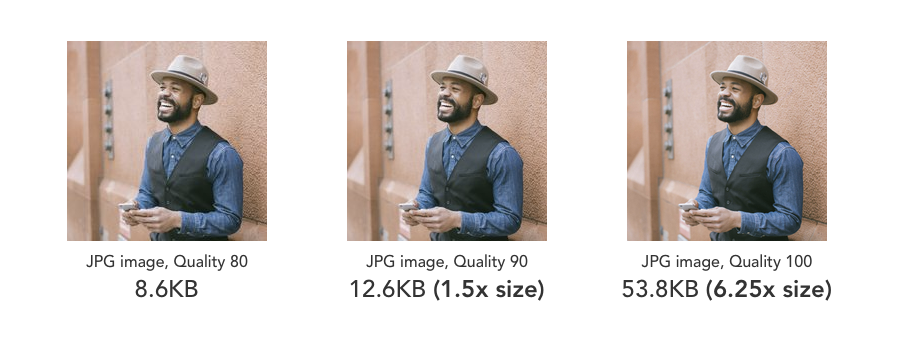
Comparison between the same image encoded at different quality levels. The images are almost similar visually but have different sizes.
A simple way to do accomplish format and quality optimization is to use ImageKit to deliver your images. It automatically converts an image to WebP wherever possible and also optimizes the image quality in real-time.
3. Build for mobile
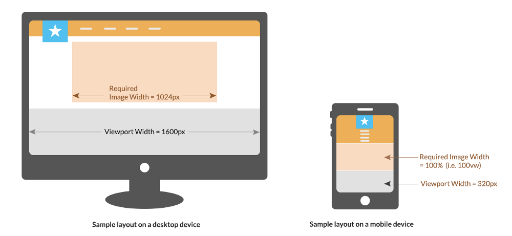
In today’s world, if you are serious about running a website, ignoring mobile users is a sin. Data suggests that almost 60% of the global traffic originates from mobile devices. And yes, while mobile phones have gotten powerful and mobile networks have become better, data suggests that mobile data speeds are still much slower than broadband speeds. There are countries or areas within countries where the mobile data connection is flaky. So, it is important to be extra careful when designing web experiences for mobile.
If you have a responsive website for desktop and mobile, you can switch to using responsive images. With responsive image tags, using the `srcset` and the `sizes` attributes of the img tag, you can provide the browser with a list of variants for a single image and a definition of the relative image size on different screens. The browser then decides the best image size to load on a particular device from the available list based on the device dimensions and the layout you specify.
The `sizes` attribute gives information about the image layout, the `srcset` attribute gives the image list with the actual width specified against each URL.
Another factor that comes into picture with mobile devices is the Device Pixel Ratio or the DPR value. Modern mobile phones have high density screens that pack more pixels in the same square inch.
An image that look fine on regular devices, would look slightly blurred on a high density screen. A solution to this is to load a 2x size image on screens with DPR 2, a 3x image on screens with DPR 3 and the normal image 1x size image on other devices. This too can be accomplished using the responsive image tag as shown below.
A modern specification called Client Hints, makes it simple to get started with responsive images and makes the code look much cleaner as compared to the `srcset` and `sizes` attribute method. How client hints work is a huge topic in itself that it is out of scope for this post and has been covered in detail here.
ImageKit provides you with a URL-based DPR parameters along with resize and crop parameters, and also supports client hints, that makes it very easy to use responsive images and deliver perfect images across devices.
4. Load fewer resources
Even after you have optimized all of your images, loading too many of them is bound to slow down your website and negatively impact the user experience. I am not advocating that we should use lesser images. But, there are cases where we can avoid using images or avoid loading them up front.
For example, instead of loading images, you can create buttons, gradients and other advanced elements using CSS.
The other more important technique that you can use is lazy loading for your images. Lazy loading basically means that we defer loading of images that are not required immediately. Typically, any image that is not visible to the user on his screen or the viewport, can be loaded at a later point in time i.e. when the image enters or is about to enter the viewport.
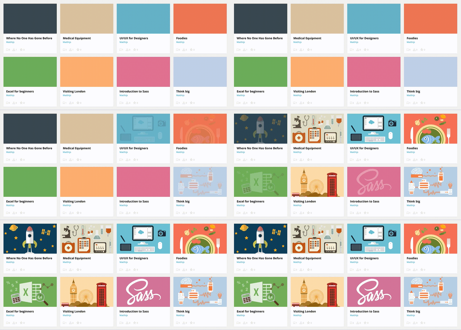
Consider a case where you have 100 products on your web page. If you request all the 100 product images at the same time and at the very beginning, it would slow down the load time. The images would compete for network bandwidth and CPU resources with other critical items on the page like CSS and JS.
With lazy loading, we would only load, let’s say, 30 images that are visible to the user initially. Then, when the user starts scrolling down the page, we will keep loading more images. This would help improve the initial load time and the user experience. There will be cases where the user doesn’t scroll down the entire page and hence some images would not get loaded at all. Thus, you also end up saving on bandwidth costs for image delivery.
Getting started with lazy loading is very simple with JS libraries like jQuery Lazy. You can also use the latest IntersectionObserver API which is much more performant than the JS libraries available for lazy loading.
5. Use a good CDN for image delivery
Once you have solved for the size of the images and the number of images that get loaded on a particular page, the next step is to ensure that the images that do get loaded on your website, are loaded quickly. Decreasing the image load time will not only help you get a faster overall page load time and thus a better the user experience on your website, but would also help you rank higher on search engines.
Content Delivery Networks or CDNs are a set of globally distributed caching / proxy servers. This article by Incapsula does a good job of explaining how a CDN works.

Let’s say your website server is located in USA. A content delivery network caches your images on its globally distributed network of servers (it’s more complex than that but for the sake of simplicity, let’s assume this). Then, if a user from Brazil requests an image from your website, instead of getting that image from your server in USA, the CDN delivers it from a node closest to that user in Brazil. This cuts down the round trip time needed to load an image. Some of the notable CDNs are listed on this Wikipedia page.
When selecting a CDN, make sure that the CDN supports HTTP/2. HTTP/2 is a new protocol for delivering content on the web that can help speed up the loading time significantly. It uses techniques like multiplexing, header compression and server push to reduce page load time. HTTP/2 is now supported by the following CDNs. This demo page does a good job at visually explaining the performance difference between HTTP/2 and the older HTTP/1.1 protocol.
ImageKit provides you with a CDN that is HTTP/2 enabled out of the box. Without any extra effort, you can get the best-in-class delivery for your images (and even other static files) using ImageKit.
How can I test my website for image related issues?
Well there are quite a few tools that you can use to test a website specifically for image related issues. One way is to use this website analyzer by ImageKit. Just type in a page URL and within a few seconds it would give you suggestions regarding resizing, best format, lazy loading and HTTP/2. Google has also worked on an open-source tool called the Lighthouse. This tool comes integrated in the latest versions of Chrome and can perform a thorough analysis of not just the images on your website but also other issues that might be impacting performance. Google PageSpeed insightsalso points out if you are loading unoptimized images on your website apart from other recommendations.



1 Comment