BY Tubik Studio
Design, as well as many other fields, is built upon the works and discoveries of the great professionals. Everyone who wants to be an expert in their craft often seeks for the guidance to learn how to do things right. Various books and articles written by gurus are now in a free access on the internet so those striving at knowledge can find the essential instruction without efforts.
We often share quotes and wise thoughts from the best experts in the digital design field in Tubik blog. You can find the short insight into Design Is a Jobby Mike Monteiro, Designing for Emotion by Aarron Walter, as well as the set of wise thoughts from typography master Erik Spiekermann. Continuing Tubik Studio Quotes Collection, here’s a fresh set of quotes from the well-known book “Don’t Make Me Think” by Steve Krug.
The first edition was published in 2000 and then it was revisited in 2014 making it relevant and useful nowadays. Steve Krug sets some basic principles on the usability of interfaces and shares them with professionals working in this field which makes the book one of the top essential resources recommended for UX designers. “Don’t Make Me Think” describes the key points, examples and insights which are important to know about website usability. The major idea is to create designs with which users wouldn’t need to think too much how the interface works — this way it becomes not only problem-solving but also easy to use. Here are 20 quotes reflecting some key points from “Don’t Make Me Think”.

***
If something requires a large investment of time — or looks like it will — it’s less likely to be used.
***
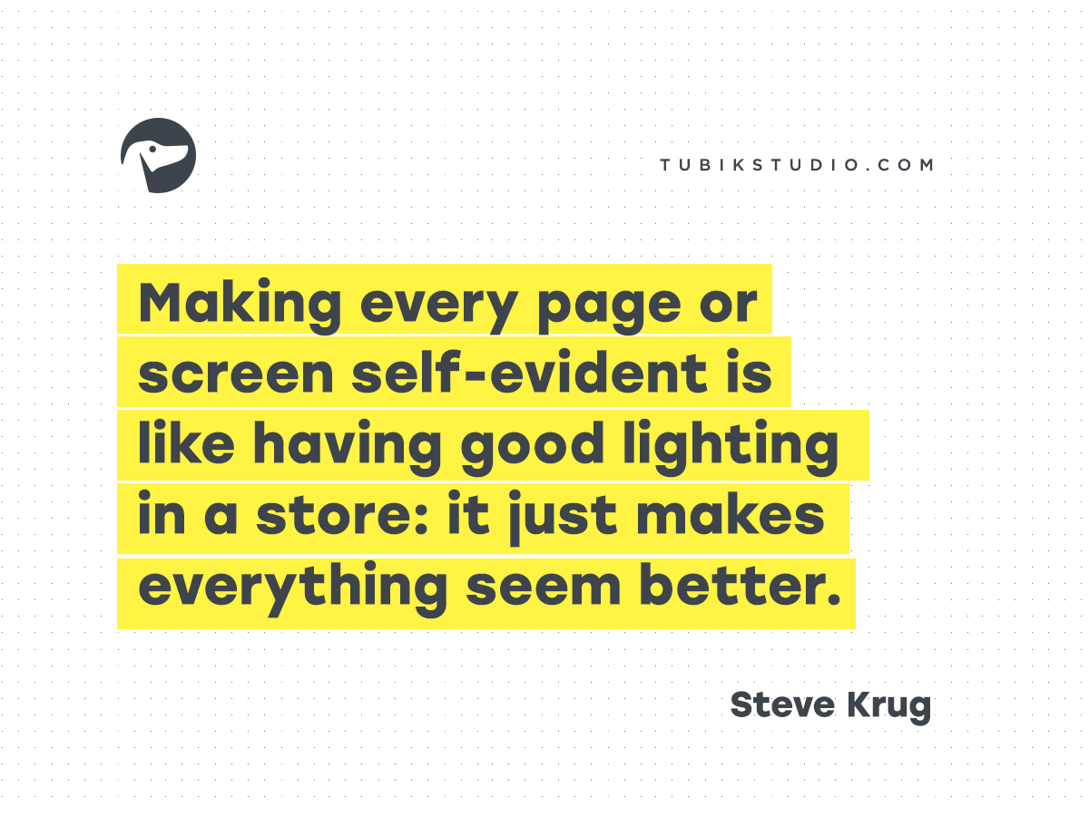
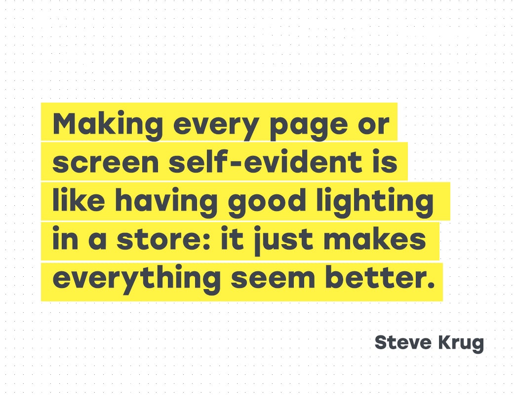
Making every page or screen self-evident is like having good lighting in a store: it just makes everything seem better.
***
A lot of happy talk is the kind of self-congratulatory promotional writing that you find in badly written brochures. Unlike good promotional copy, it conveys no useful information, and it focuses on saying how great we are, as opposed to delineating what makes us great. Instruction must die.
***
Accessibility is the right thing to do. And not just the right thing; it’s profoundly the right thing to do, because the one argument for accessibility that doesn’t get made nearly often enough is how extraordinarily better it makes some people’s lives. How many opportunities do we have to dramatically improve people’s lives just by doing our job a little better?
***
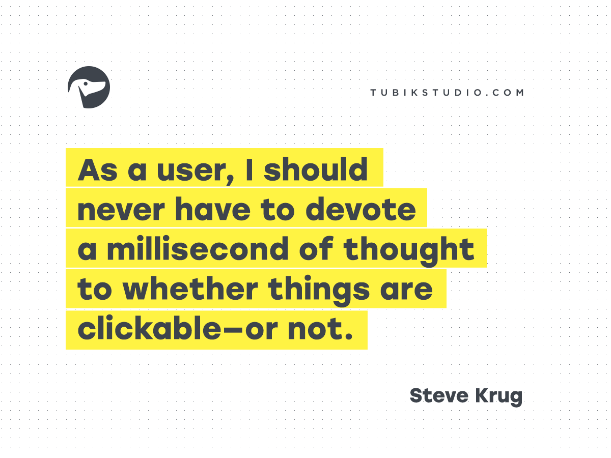
Another needless source of question marks over people’s heads is links and buttons that aren’t obviously clickable. As a user, I should never have to devote a millisecond of thought to whether things are clickable — or not.
***
In the last few years, making things more usable has become almost everybody’s responsibility. Visual designers and developers now often find themselves doing things like interaction design (deciding what happens next when the user clicks, taps, or swipes) and information architecture (figuring out how everything should be organized).
***
A person of average (or even below average) ability and experience can figure out how to use the thing to accomplish something without it being more trouble than it’s worth. Take my word for it: It’s really that simple.
***
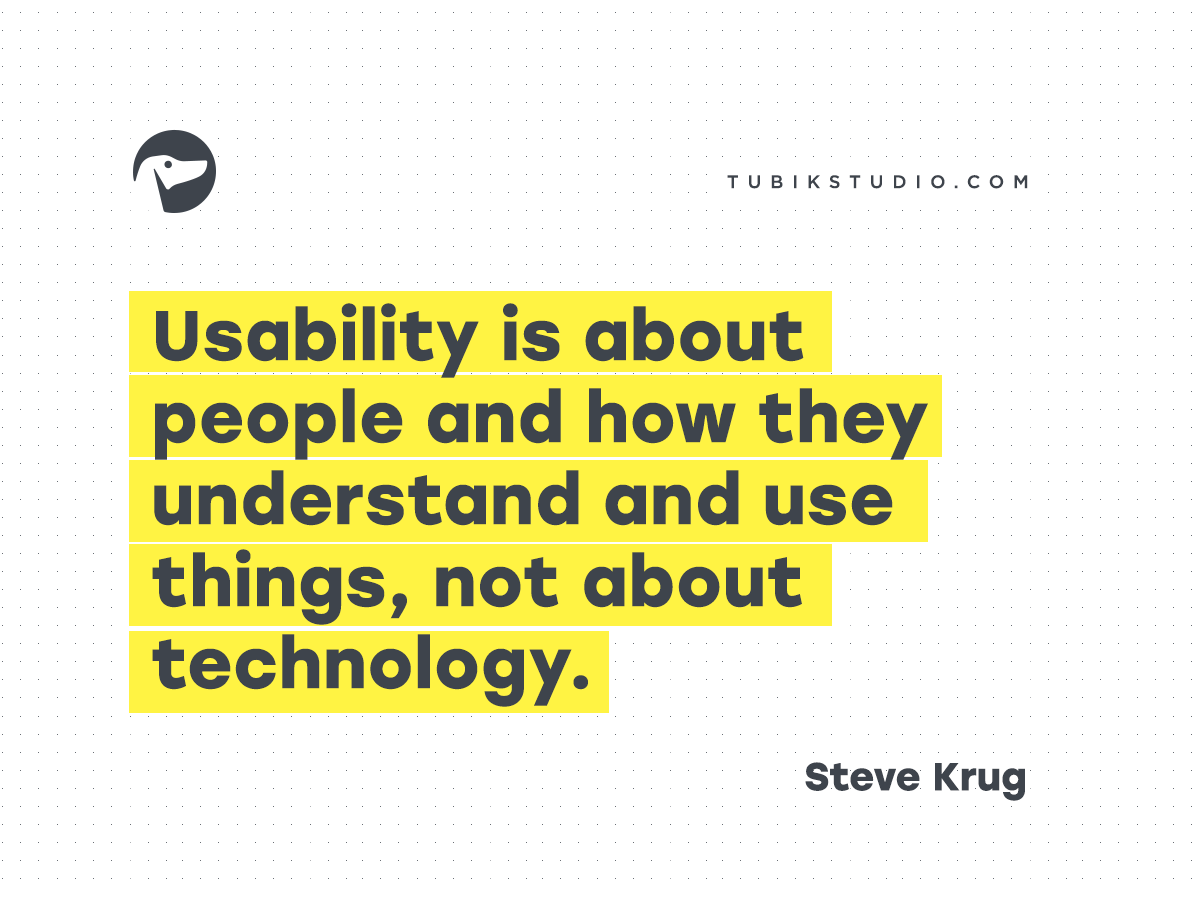
Usability is about people and how they understand and use things, not about technology.
***
The main thing you need to know about instructions is that no one is going to read them — at least not until after repeated attempts at “muddling through” have failed.
***
The more you watch users carefully and listen to them articulate their intentions, motivations, and thought processes, the more you realize that their individual reactions to Web pages are based on so many variables that attempts to describe users in terms of one-dimensional likes and dislikes are futile and counter-productive. Good design, on the other hand, takes this complexity into account.
***
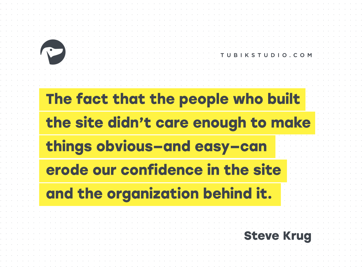
The fact that the people who built the site didn’t care enough to make things obvious — and easy — can erode our confidence in the site and the organization behind it.
***
In reality, though, most of the time we don’t choose the best option — we choose the first reasonable option, a strategy known as satisficing.
***
The problem is there are no simple “right” answers for most Web design questions (at least not for the important ones). What works is good, integrated design that fills a need — carefully thought out, well executed, and tested.


16 Comments