BY Grace Noh
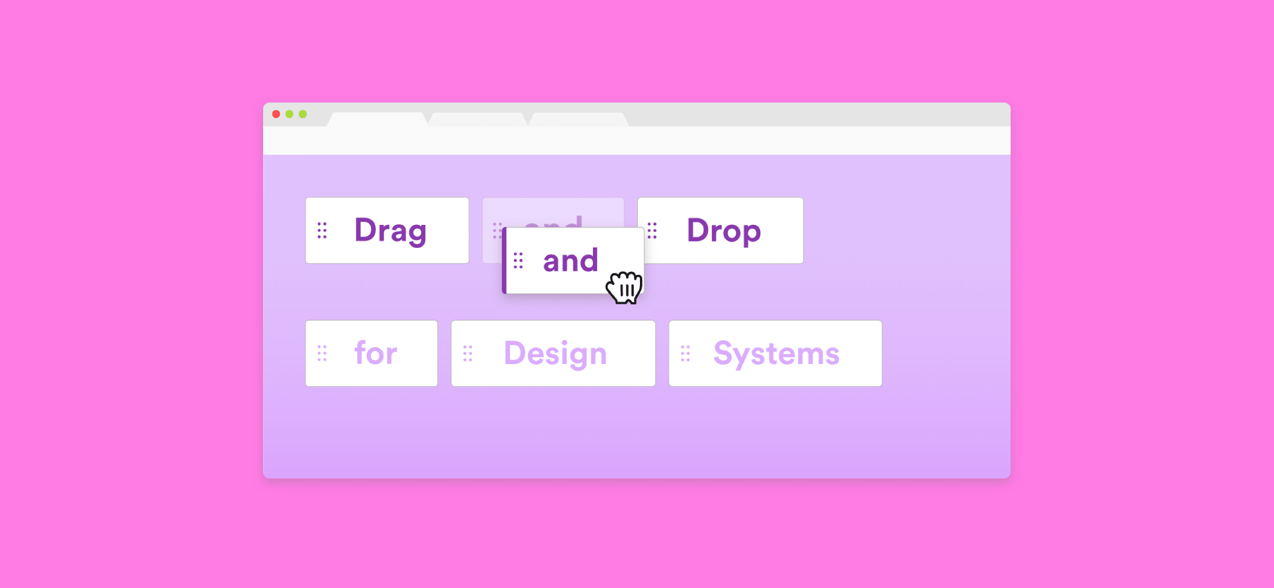
You probably use drag and drop in your everyday interfaces — dropping Gmail threads into folders, moving around Trello cards, or rearranging tabs in Chrome. These interactions are a lot more complex than you think, something that I learned while designing drag and drop patterns at VMware.

Dropping Gmail threads into folders

Moving Trello cards around (Asian crackers😋)

Rearranging tabs in Chrome
Drag and drop interactions are often overlooked or go unnoticed. Sometimes they happen so naturally that you don’t even realize it. But if you look closely and compare these three examples, each one demonstrates very different UX standards around drag and drop.
There’s nothing wrong with these interfaces having different UX standards around drag and drop. Each interface probably selected certain patterns over others for a reason. For example, maybe Trello chose to tilt cards when they are dragged because this behavior fits their friendly design language.
But where the problem lies is when there aren’t clear UX standards for drag and drop within a common interface. You might come across instances when dragging something in one part of an interface is a completely different experience in another.
To illustrate this, let’s take a look at Salesforce’s accessible drag and drop library. It showcases five patterns for drag and drop, each of which is a drastically different experience from the other.

Salesforce’s accessible drag and drop patterns
While many great points are made about accessibility (check out an interesting article written about it 👍🏽), unfortunately, there is little design consistency across these five patterns. A different cursor is used in each of the five patterns, and there are three different icons being used as drag handles:

But which one is for drag and drop? Answer: All of them.
Does a three-line icon indicate a draggable element? Or is it a three-dot icon? Which of the five cursors shows that I can drag things? Imagine the confusion of having all five patterns applied to one interface!


