Modern businesses need to stay constantly relevant to their consumer bases if they want to survive, and one of the best methods for doing that is driving customer engagement and creating valuable, memorable experiences.
Content is a crucial part of this, as is responsive web design that reacts intuitively on various screens and devices. However, one technique with tremendous potential for driving engagement that often goes overlooked is micro-interactions.
Micro-interactions are the little animations or visual responses users see when they perform certain actions. An example would be the “Follow” icon filling in when you click it to follow a Twitter account, or the small, colorful flash that happens after you “Favorite” a Tweet. These may seem frivolous at first, but micro-interactions have a significant psychological impact on users, and the reasons micro-interactions are meaningful are rooted in human psychology.
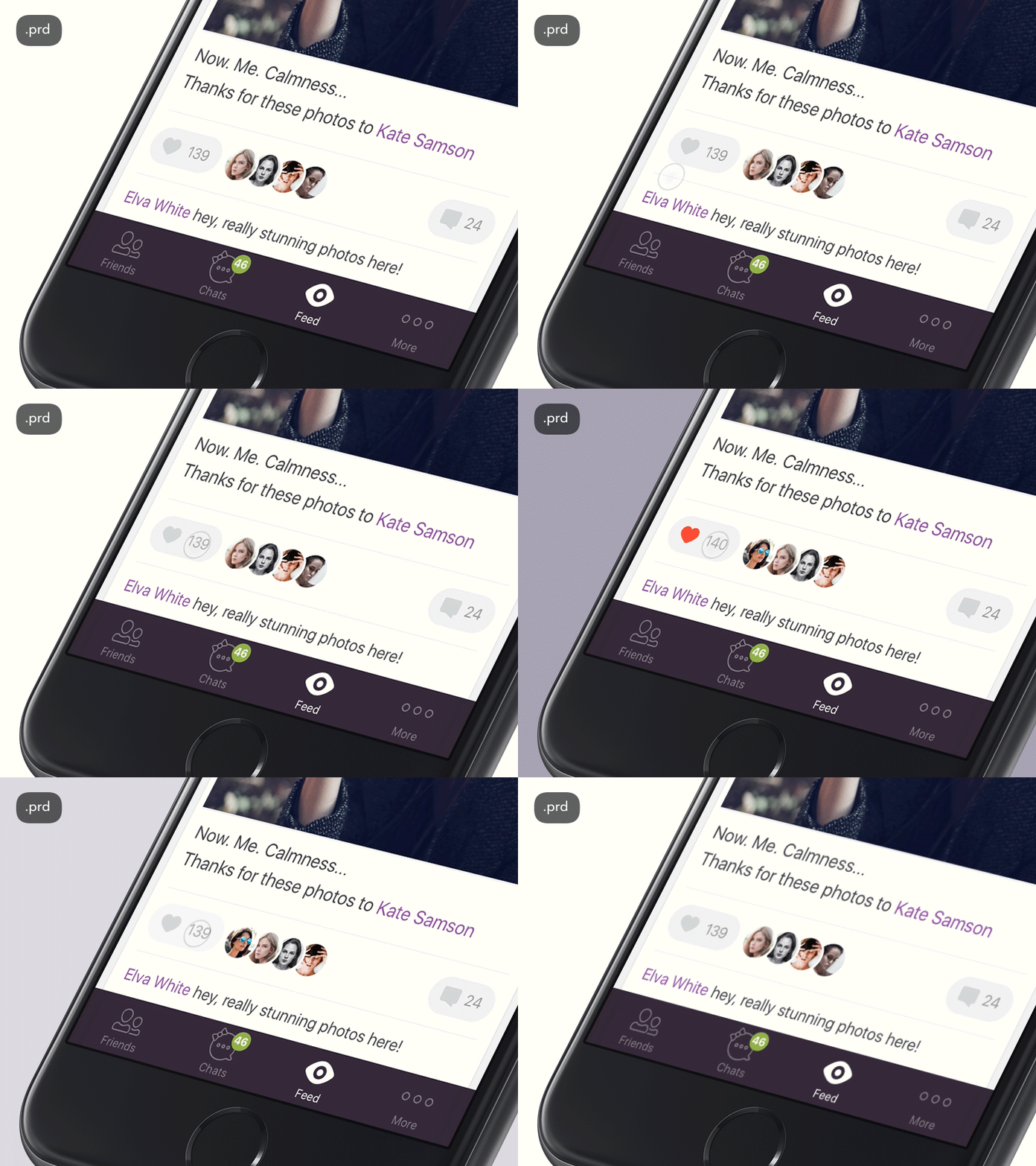
Micro Animation of Like by Roman Wagner.
Micro-Interactions Play on Human Nature
Many of us perform countless micro-interactions every day without realizing it. Any time you engage in simple, quick actions with an interface (such as swiping your phone screen to ‘snooze’ your alarm in the morning), you are having a micro-interaction.
As with any interaction, there is an action and a reaction. A user performs an action, and the interface on which it was performed responds to let the user know they successfully performed the intended action.

Volume Control Micro Animation by Nick Buturishvili.
A micro-interaction conveys to the user an action has been performed. Once the action has been performed, the user receives an indication of some kind to let him or her know they succeeded in their intention.
Micro-interactions guide users to where they can manipulate or interact with elements of an interface. The four basic elements of a micro-interaction are:
- The Trigger: This is what initiates an action. On most interfaces, this includes clicking or touching specific elements of the interface.
- Rules for Responses: The micro-interaction bases the response on how the user interacted.
- Feedback: This is the response that lets the user know the action was performed successfully.
- Loops: The end of the cycle is whatever happens next. Clicking a “Share” button on a social media post results in a notification to the user that the post has been “Shared,” and the result is a new post on the user’s profile.
This may sound basic, but there is a psychological factor that explains why these micro-interactions are meaningful: people generally enjoy knowing they have performed an action correctly. A good micro-interaction accomplishes this quickly and efficiently.
Designing good micro-interactions requires understanding that these instances largely go unnoticed by the user, but that does not mean they are meaningless. These small indications tell the user they succeeded in a task – however small – and generally make life easier by limiting uncertainty<.
Micro-Interactions Make or Break Apps
Micro-interactions definitely have a place in webpages and desktop applications, but where they truly shine is in the realm of mobile apps. Touchscreens would be clumsy and awkward to navigate without micro-interactions, and poorly conceived micro-interactions are going to push users away.
There are countless apps in existence, and many mirror the capabilities or serve the same functions as others.

Notification Micro Animation by Gal Shir.
You more than likely have a favorite weather app, a preferred social media platform, or other apps on your smartphone that you choose based on personal preference. Take the time to analyze what you like about those apps and why you chose them over others. You’ll likely find it is due to various forms of micro-interactions.
You choose your favorite apps based on how you interact with them and how they respond to your inputs. Despite their simplicity, these are the little details that spark interest and keep users engaged.
When crafting micro-interactions for your site, it’s vital to consider several factors:
Repetition
Micro-interactions can’t be annoying. Some apps may have flashy or humorous micro-interactions meant to delight users, but more often than not they do quite the opposite. Novelties and quirky micro-interactions may be fun for a user for a few times, but after enough repetition they can become obnoxious and irritating, driving users away to an alternative.
Make sure your micro-interactions’ feedback is noticeable enough for users to process it, but not so overt as to become a frustrating distraction after repeated uses.
User Preferences
Allowing users a modicum of control over micro-interactions is a great way to ensure they last for the long haul. For example, many people like haptic feedback on their smartphones – the subtle, quick vibrations when you tap the letters on your touchscreen’s keyboard. They let the user know they successfully hit a letter.
However, some may grow weary of the vibrations and come to dislike them. Allowing users to toggle elements of a micro-interaction on and off is a great way to keep them engaged.
Simplicity
Micro-interactions are small, so overthinking or overcomplicating them is a death sentence. Users are going to quickly tire of overly complex or ornate feedback.
When crafting the text, colors, and other design elements of a micro-interaction, don’t make the design any more complex than the action, itself. You need to offer just enough feedback to be effective.

Action Icon Animations by Mamun Srizon.
Harmony
Make sure the parts of your interface that create micro-interactions are in sync with the other visual elements of the interface. You certainly want to draw attention to the areas of an interface a user can manipulate, but they don’t have to be especially bold or garish to let users know they can interact with them.
Details
Since your micro-interactions are so small, there’s no reason for them not to be perfect down to the minutest detail. Make sure every element of your micro-interactions work as intended and are visually striking before you launch.
You also need to consider how different users are going to perceive these micro-interactions: is every user going to have the same interaction?
Micro-Interactions Delight Users
The most successful micro-interactions are – counterintuitive though it may be – the ones that go unnoticed when they are used, but very noticeable when they are changed. A good micro-interaction can stand up to repetitive use and fits in the overall design of the interface.
Straightforward responses are generally well-received in many aspects of life and human interaction, and the same goes for micro-interactions on user interfaces. The simplest design will more than likely yield the best reception.
Mobile app design hinges on micro-interactions more than you may initially realize. When you take the time to assess your personal preferences and behaviors, it’s easier to recognize how you can improve your app’s micro-interactions for more meaningful and engaging user interactions. More people than ever not only prefer to use mobile devices – they depend on them throughout their daily activities.
Keep these pointers in mind as you consider new ways to engage and delight your app’s users. Creating valuable micro-interactions is a fantastic method of keeping users engaged with your apps, and they also convey reliability. Users download and use apps to serve a specific function. Micro-interactions are the details that guide them as they navigate and use apps and let them know they’re performing their intended actions correctly.
Though they may seem like small, frivolous details at first, the truth is quite the opposite. Micro-interactions are what keep your users engaged on the most basic levels.

