BY TEO SIANG
Interaction design is an important component within the giant umbrella of user experience (UX) design. In this article, we’ll explain what interaction design is, some useful models of interaction design, as well as briefly describe what an interaction designer usually does.
A simple and useful understanding of interaction design
Interaction design can be understood in simple (but not simplified) terms: it is the design of the interaction between users and products. Most often when people talk about interaction design, the products tend to be software products like apps or websites. The goal of interaction design is to create products that enable the user to achieve their objective(s) in the best way possible.
If this definition sounds broad, that’s because the field is rather broad: the interaction between a user and a product often involves elements like aesthetics, motion, sound, space, and many more. And of course, each of these elements can involve even more specialized fields, like sound design for the crafting of sounds used in user interactions.
As you might already realize, there’s a huge overlap between interaction design and UX design. After all, UX design is about shaping the experience of using a product, and most part of that experience involves some interaction between the user and the product. But UX design is more than interaction design: it also involves user research (finding out who the users are in the first place), creating user personas (why, and under what conditions, would they use the product), performing user testing and usability testing, etc.
The 5 dimensions of interaction design
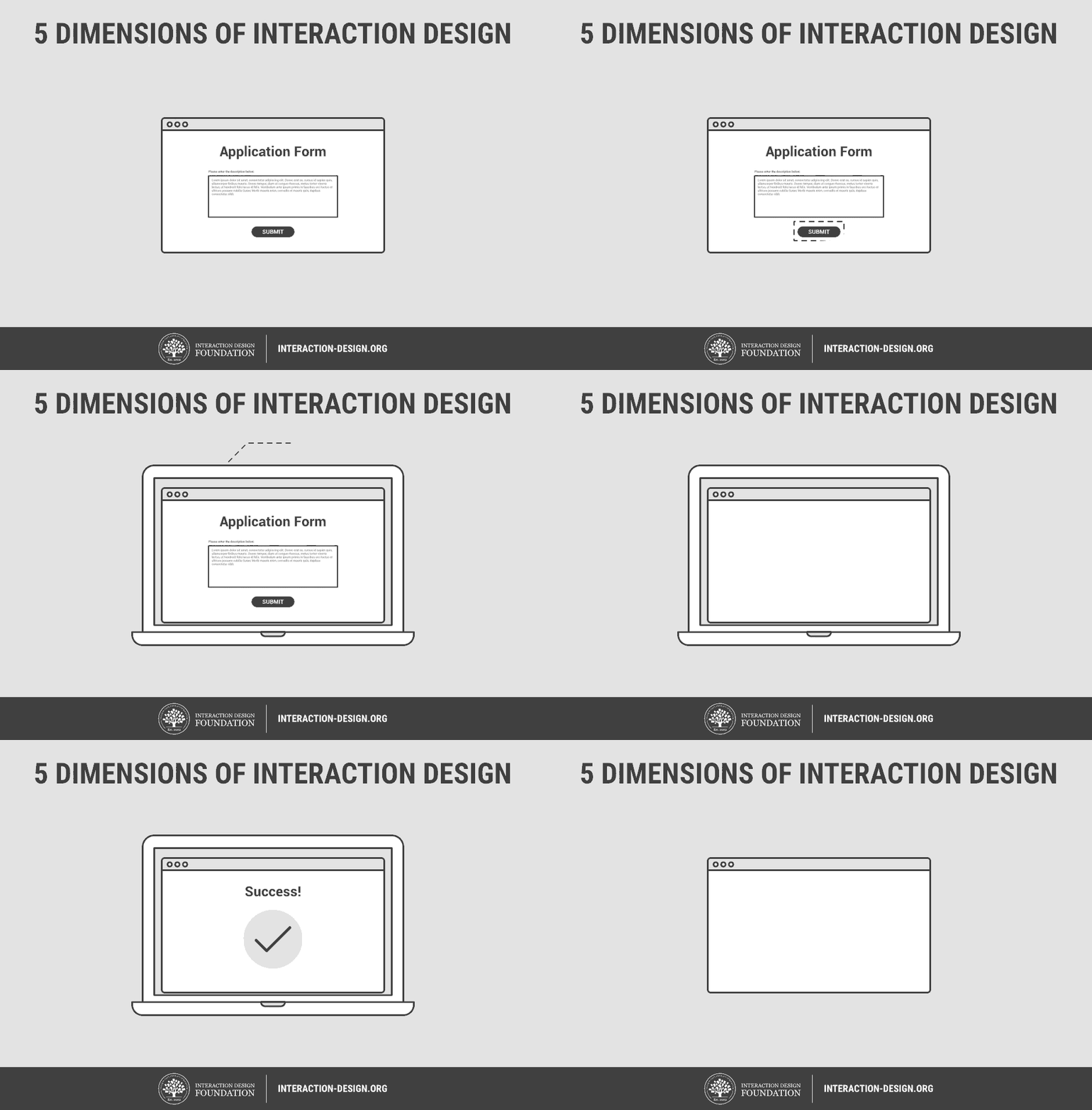
The 5 dimensions of interaction design(1) is a useful model to understand what interaction design involves. Gillian Crampton Smith, an interaction design academic, first introduced the concept of four dimensions of an interaction design language, to which Kevin Silver, senior interaction designer at IDEXX Laboratories, added the fifth.
1D: Words
Words—especially those used in interactions, like button labels—should be meaningful and simple to understand. They should communicate information to users, but not too much information to overwhelm the user.
2D: Visual representations
This concerns graphical elements like images, typography and icons that users interact with. These usually supplement the words used to communicate information to users.
3D: Physical objects or space
Through what physical objects do users interact with the product? A laptop, with a mouse or touchpad? Or a smartphone, with the user’s fingers? And within what kind of physical space does the user do so? For instance, is the user standing in a crowded train while using the app on a smartphone, or sitting on a desk in the office surfing the website? These all affect the interaction between the user and the product.
4D: Time
While this dimension sounds a little abstract, it mostly refers to media that changes with time (animation, videos, sounds). Motion and sounds play a crucial role in giving visual and audio feedback to users’ interactions. Also of concern is the amount of time a user spends interacting with the product: can users track their progress, or resume their interaction sometime later?
5D: Behaviour
This includes the mechanism of a product: how do users perform actions on the website? How do users operate the product? In other words, it’s how the previous dimensions define the interactions of a product. It also includes the reactions—for instance, emotional responses or feedback—of users and the product.
See how 5 dimensions of interaction design come together in the animation below:

Important questions interaction designers ask
How do interaction designers work with the 5 dimensions above to create meaningful interactions? To get an understanding of that, we can look at some important questions interaction designers ask when designing for users, as provided by Usability.gov(2):
- What can a user do with their mouse, finger, or stylus to directly interact with the interface? This helps us define the possible user interactions with the product.
- What about the appearance (color, shape, size, etc.) gives the user a clue about how it may function? This helps us give users clues about what behaviors are possible.
- Do error messages provide a way for the user to correct the problem or explain why the error occurred? This lets us anticipate and mitigate errors.
- What feedback does a user get once an action is performed? This allows us to ensure that the system provides feedback in a reasonable time after user actions.
- Are the interface elements a reasonable size to interact with? Questions like this help us think strategically about each element used in the product.
- Are familiar or standard formats used? Standard elements and formats are used to simplify and enhance the learnability of a product.


