BY Jon Moore
Christian Beck wrote an incredibly thorough article about the UX behind switching accounts in digital products, so I decided to ride the coattails of his article and write one of my own, but from a tactical, design perspective.
Account switchers have become a common (and very necessary) design pattern for designing products which may be used by one or many users across a team, agency, or organization.
Similarly, app switchers allow you to seamlessly jump between multiple products in a suite while maintaining a familiar navigation structure and information hierarchy.
This tutorial showcases different ways you can design account switchers and app switchers, and provides real-world examples where you can see these methods in practice.
Account Switchers
Dropdown — Google Suite
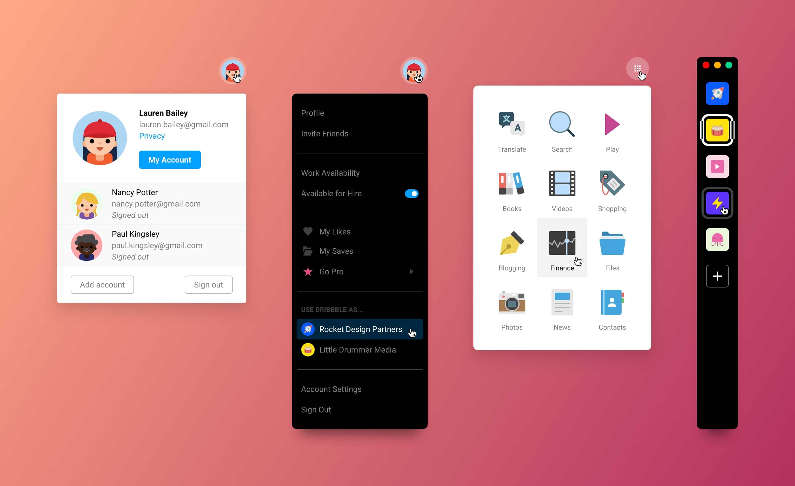
Google’s account switcher does well because it makes it clear which account is active, which ones are authenticated (the ones you’re logged into), and how you can add others. The grey background used for the other accounts helps offset them from the active account and the actions available in the footer.

Study the design above and notice how there are essentially 5 rectangular sections to the dropdown:
- Current account
- Alternate account #1
- Alternate account #2
- Alternate account #3
- Actions
Each of these sections are stacked on top of each other with a white background container so it’s easy to add and remove alternate accounts.
Dropdown — Dribble
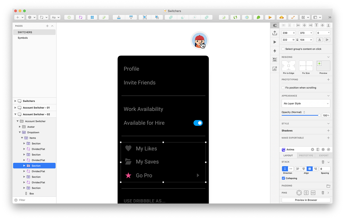
Switching accounts in Dribbble is equally as simple, but a little more hidden. They combine app settings, personal content, and accounts into a simple dropdown in the global nav.
Three unique list item symbols are used in this design:
- Text-only
- Icon + Text (left, right, or both)
- Avatar + Text
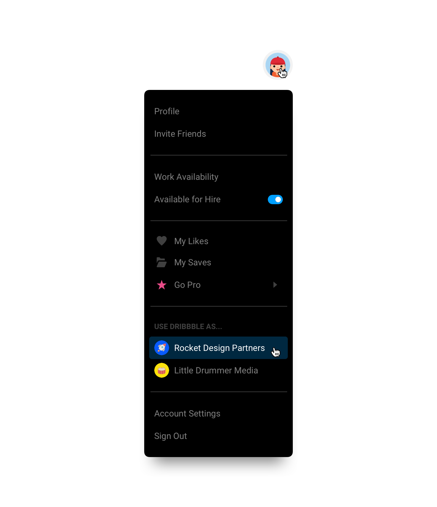
I’m a strong advocate of Auto Layout feature of the Anima App plugin, so definitely go download that. It allows you to create stacks of layers that will automatically maintain consistent spacing, which comes in handy for the subsections in this dropdown.
I also use their Padding feature to maintain the padding outside of the list items. That way if I ever delete a section, the plugin will automatically resize the black container for me.
App Switchers
Dropdown — Google Suite (download it)
The Google app switcher is a well-recognized pattern for switching between apps in large suite of products. This design pattern scales well when adding new products, so unless you have dozens upon dozens of apps, you can probably make it work.
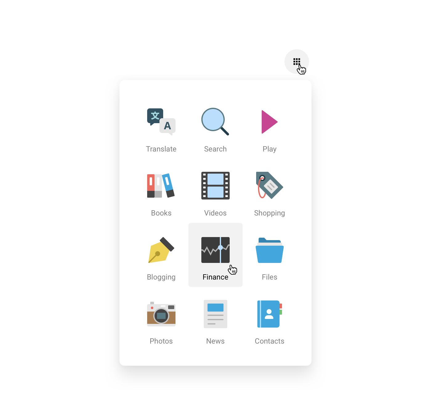
I created a basic symbol with an image, text, and background layer for the hover state. As a general rule, if you’re reusing the same design component more than three times, it’s worth your time to create a repeatable symbol.
Left Menu — Slack
Technically speaking, the Slack switcher isn’t really an app switcher so much as it’s an account switcher, but it’s a good pattern for both because every option is clearly visible at all times, and docked on the side of the UI.

Slack Design recently updated the UI so that the active account was more prominently outlined, so this active state is baked directly into the symbol. Using Sketch’s style overrides, we can create a style for the thick white border of the active account, and a slightly more transparent white border for the hover state.

I opted to use image overrides for the logos in the switcher, but if you absolutely need SVGs, then you might not be able to take advantage of symbols. In the meantime, help me convince Sketch that image overrides should support SVGs 😋
