BY Teresa Man
Mental models are explanations of how we see the world. They influence product design every step of the way from the conception of an idea to the perception of an experience.
In The Design of Everyday Things, Don Norman wrote that irrespective of how designers envision their products (ie. the designers’ conceptual models), end users will always project their own mental models rooted from individual biases and worldviews onto their experiences of products.
To the extent that these models inform users’ perceptions, they are also indispensable constructs for design thinking across all stages of product definition. In this post, I will write about mental models and by extension, behavioural economics, that influence product design at a holistic level, especially ones that function in relation to one another. Let’s begin!
_________________________
On Values and Defaults:
Endowment Effect

Things are assigned a lower value when they have to be acquired. For example: you may sell a tub of ice cream for $5, but only want to pay $3 for it when you are buying.
Why does this matter?
A study has shown that people are more inclined to give up their data for a nominal gain than to pay the same amount for privacy. In other words, they value the disclosure of private information more than the protection of public data. In the midst of ever-increasing headlines about data exploitations and security leaks from tech conglomerates, this has tremendous implications on information privacy because the default state of settings become a strong determinant in whether or not users are more open to sharing. When data is set to public by default, such as transactions on Venmo, people hold less value towards their privacy and in turn become more comfortable with their information being shared. This brings us to our next mental model…
Status Quo Bias

A fancy way to call “defaults” or “inertia”. In physics, inertia is the resistance of an object to change its state of velocity, ie. it will stay still if it is already still; move at a constant rate if already moving. We exhibit the same trait in the form of emotional bias when we show a preference for maintaining the way things are and accepting defaults.
Why does this matter?
Not unlike default privacy settings in which people tend to act in accordance with the initial suggested options, Google in their release of Chrome 70implemented their auto sign-in feature as a setting enabled by default. The feature logs users into Google web services without prompting for permission, thereby leveraging status quo bias as a means to further perpetuate Google’s reach of data collection within the G-suite ecosystem. Subscription-based products such as Spotify, Netflix and AWS (or any SaaS model in general) also thrive under this bias when people are driven to stick with products that they can cancel from at anytime.
_________________________
On Innovation:
Functional Fixedness
This is a cognitive bias in which people fail to imagine a product or experience in a novel way. Innovation is stifled by what’s called The Curse of Knowledge, in which people become so familiar with something that they cannot unlearn its traditional properties to look at it with fresh, untrained eyes. Daniel Kahneman calls this method of cognition “fast thinking” or System 1 Thinking – thoughts become so effortless that stereotypes are formed unconsciously with no room for creativity.
Adam Grant alluded to this as well in his book Originals: How Non-Conformists Move the World:
The starting point [for originality] is curiosity. We’re driven to question defaults when we experience vuja de, the opposite of déjà vu. Déjà vu occurs when we encounter something new, but it feels as if we’ve seen it before. Vuja de is the reverse — we face something familiar, but we see it with a fresh perspective that enables us to gain new insights into old problems.
No one with enough learned experiences can escape functional fixedness, not even the U.S. military. In fact, cadets are trained to reverse their direction of attention when entering a new environment and to read a landscape from right to left. The directional change contradicts their instinctive left-to-right recognition patterns ingrained by Latin-based languages and allows them to look at an environment with new eyes and easily detect anomalies.
Why does this matter?
Functional fixedness strengthens as a truism over time and cements the oldway as the right way (see this study of 5-year-olds being better original thinkers). In product, it’s important to recognize conventional inside-the-box decisions that adhere to “what has worked” versus creative opportunities for “a new normal”.
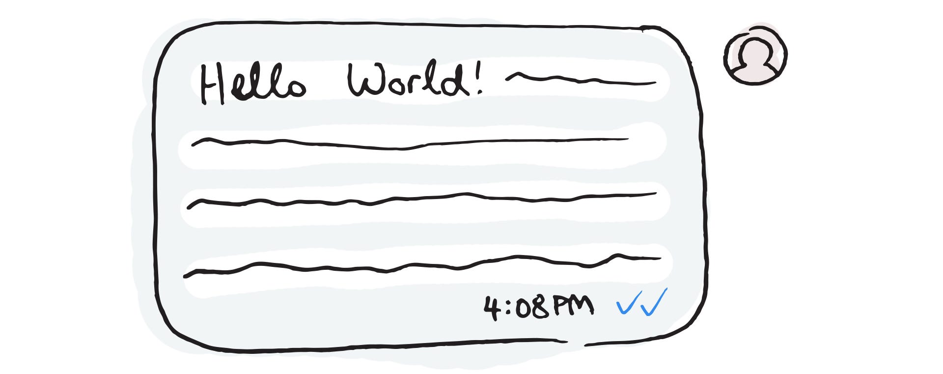
For WeChat, an innovation strategy that underpinned their success in dominating China’s mobile economy is known as “reverse micro-innovation by subtraction”. In the early days of developing the chat platform, read receipts were deliberately precluded as a product feature despite its popularity in iMessage, WhatsApp and Line. WeChat’s team saw read receipts as something that sours users’ experiences by disclosing their privacy while introducing cultural and emotional implications of feeling potentially ignored.
First Principles Thinking
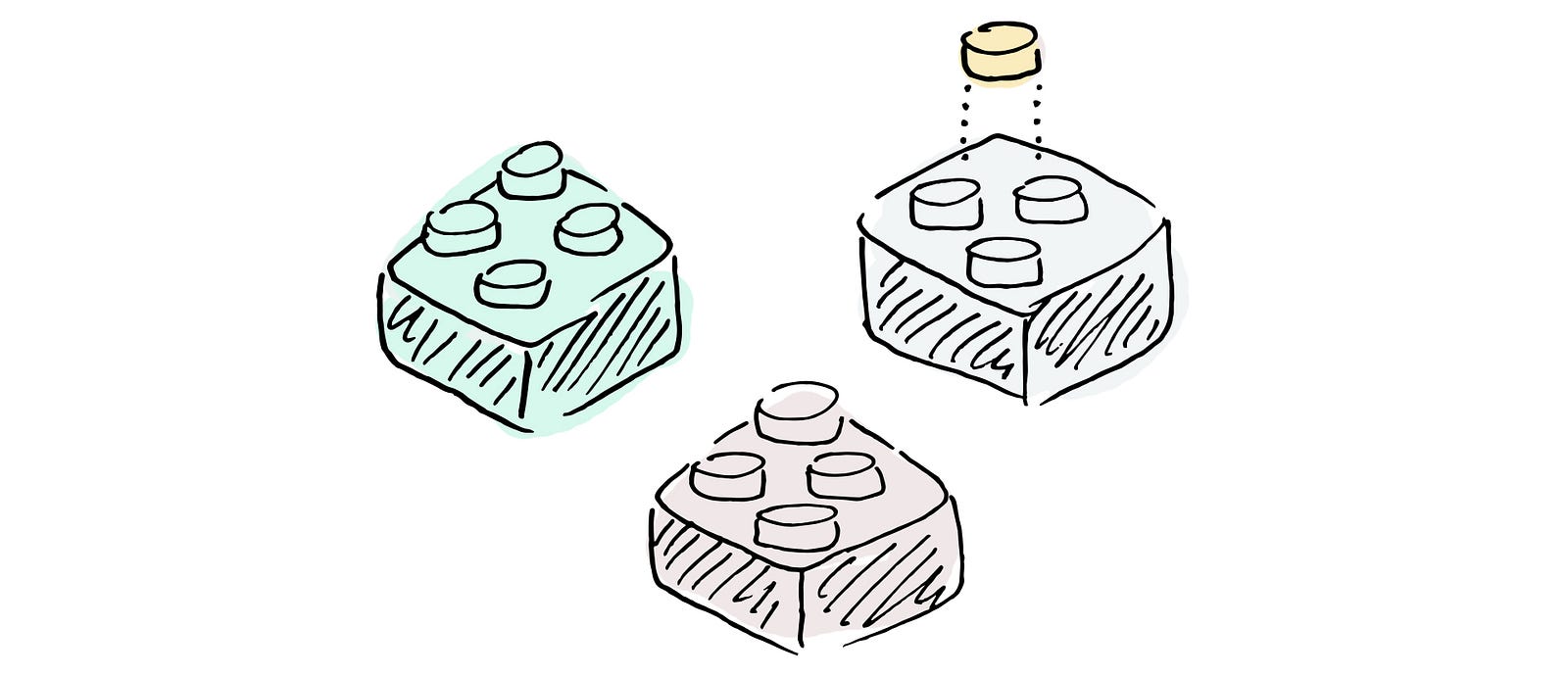
One way to avoid functional fixedness is to abstract a problem and think in First Principles. Reasoning in First Principles means to break down complex scenarios into basic, foundational truths and build a solution from the ground up. Aristotle originated the idea over 2,000 years ago and defined it as “the first basis from which a thing is known.”
Why does this matter?
Taking a First Principles approach allows you to distill any problem from its noise and to come up with radical innovations. In this interview, Elon Musk shared his adoption of First Principles in launching SpaceX and its fleet of low-cost rockets:
I tend to approach things from a physics framework. And physics teaches you to reason from first principles rather than by analogy. So I said, OK, let’s look at the first principles. What is a rocket made of? Aerospace-grade aluminum alloys, plus some titanium, copper, and carbon fiber. And then I asked, what is the value of those materials on the commodity market? It turned out that the materials cost of a rocket was around 2 percent of the typical price — which is a crazy ratio for a large mechanical product.
Reasoning by analogy, he says in another interview, is to look at what other people have done. Analogical thinking lends itself to incremental product iterations rather than groundbreaking advancements because it promotes a habit of following the footsteps of history.
_________________________
On The Fear of Missing Out:
Loss Aversion
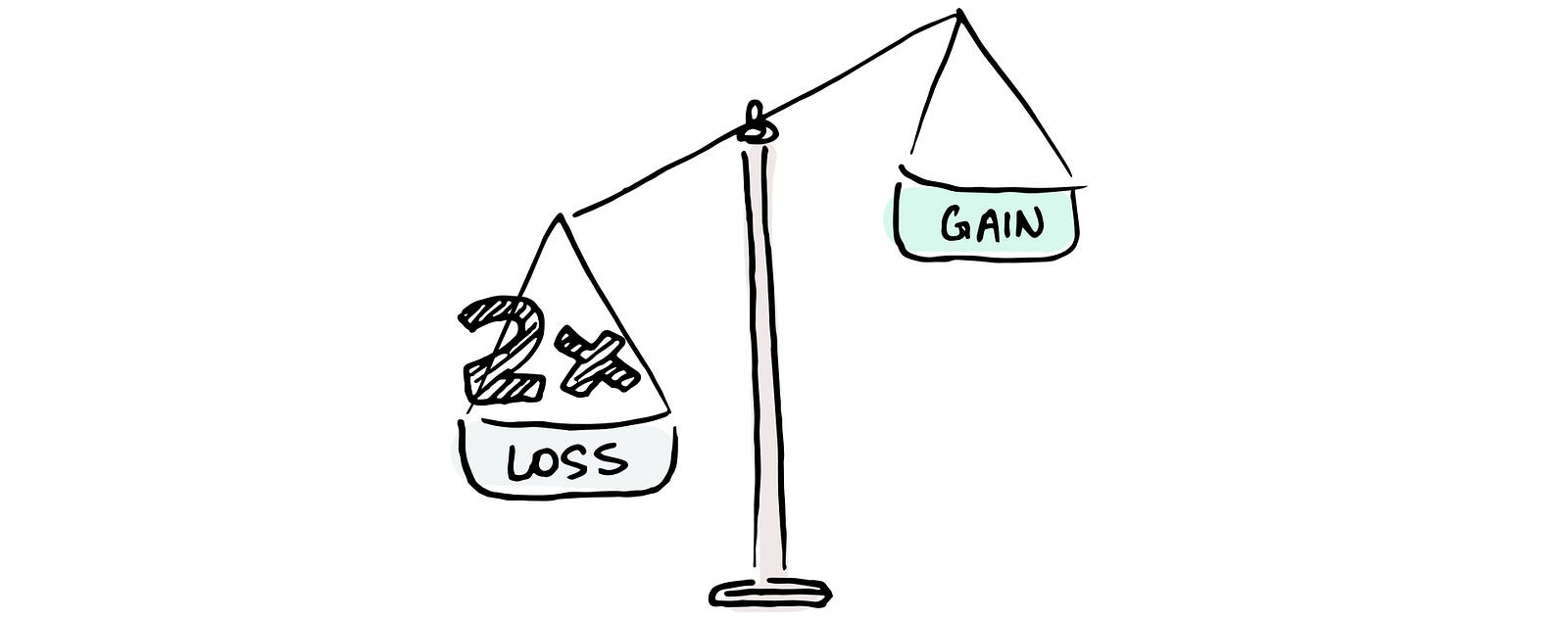
No one wants to lose. But more interestingly, people would rather avoid the loss of something than to gain the equivalent. In behavioural psychology, loss aversion is the foundation of Prospect Theory: people perceive the pain of losing to be twice as powerful as the pleasure of gaining, so they take extra risks to avoid any potential loss.
Why does this matter?
Businesses that offer trials or refunds play on the idea of loss aversion, as do ecommerce websites that label items with “only x left in stock!!!” or display countdown timers for promotions. Wealth management apps show you the prospect of your earnings across an x-year trajectory, and if you don’t sign up today and invest now, you are missing out on an irreconcilable opportunity because, as shown in fancy animated graphs, time is money. Perhaps the most well-known example of loss aversion can be found in social media, in which it is deeply embedded into platforms through something called social proof.
Social Proof

Social proof refers to how people look to others for confirmation of their own behaviours. A classic experiment in 1962 demonstrates the idea when unsuspecting elevator riders entered a lift with people inside facing the wrong way and they followed the misdirection out of conformity.
Why does this matter?
Social proof often works hand in hand with loss aversion. In the case of social media, platforms like Instagram offer small tokens of social proof to their users at all moments of interaction. Each like, comment, and follow builds social capital upon people’s identities and reinforces consistent adoption by exploiting their inherent aversion to losing community-driven validation.
_________________________
On The Importance of Users:
Network Effect
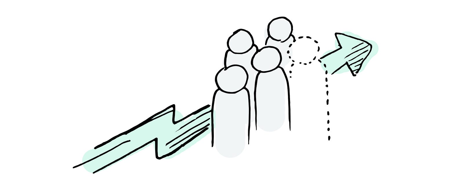
A product becomes more valuable as its number of users increases. Not to be confused with “going viral”, in which the speed of adoption increases instead of the actual product value.
Why does this matter?
Network effect is one of the most talked about mental models in the evaluation of product successes. This venture firm estimates that network effect single-handedly drives 70% of value in tech companies by creating an economic moat — a competitive advantage for a product that is difficult to replicate and builds a barrier of entry for competitors. A prime example is Craigslist. The website’s two-sided marketplace has such a strong network effect that its (almost trademark-worthy) lackluster design and subpar desktop-only experience still earns an upwards of 50 billion pageviews per month, despite newer products such as Offerup and Letgo trying to compete in the same space.
Critical Mass
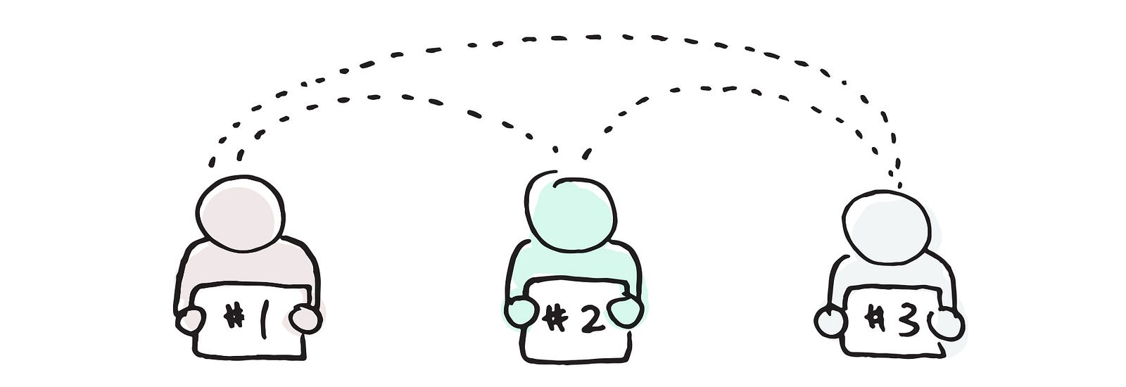
While network effect increases proportionately with number of users, critical mass as a mental model reminds us to look at it as more than a numbers game. In product development, critical mass refers to the level of user adoption required to build a self-reinforcing network effect, a tipping point, if you will, in which a product can sustain itself into a state of exponential growth.
Why does this matter?
In the early years of social media platform war, Friendster gave way to MySpace which was eventually superceded by Facebook — all due to a chain of failed attempts at attaining critical mass. Friendster at its peak had over 100 million user accounts (the right recipe for a strong network effect), but not a lot of users were connected to each other. The loose affiliations amongst members were therefore weak and highly susceptible to network abandonment. MySpace on the other hand, rushed to monetize early while Facebook held its ground in reaching a critical mass of 1 billion users before going public.
At a more granular level, the importance of critical mass is shown in how Quora designed their metrics around testing the efficacy of author credentials. Credentials are summaries of experiences added by users to help vouch for their reliability, eg. a question about raising chickens answered by a “farmer of 20 years with masters in Agriculture and Food Sciences”. Quora’s design team recognized that the number of users who adopt this feature does not actually represent strength in network effect but rather potentially low-quality engagement (eg. if users proclaim to be something all-encompassing and meaningless, such as “citizen of the earth”). Instead, they devised their own qualitative metrics to find the true value of this new feature in establishing a self-sustaining community of users asking and answering questions.
_________________________
On The Presentation of Information:
Anchoring

Anchoring is a cognitive bias in which we make decisions based on an initial value or idea presented. For example, a house may be worth $500k, but an anchor of 1 million set by a seller may result in offers ranging from $800k to $900k.
Why does this matter?
We tend to rely heavily on the first piece of information given to us, even if the information may be completely irrelevant. Chris Voss talks about setting extreme anchors in high-stake hostage negotiations and day-to-day bargains by establishing a seemingly absurd baseline that makes your target number more palatable. In product design, anchoring operates similarly and helps with conversion optimization when options are presented with contrast in mind. The first choice presented is designed to be less favourable, making subsequent ones more appealing as a result (think product comparison charts, price tags with the “original” cost, etc.). As Charlie Munger has pointed out,
The sensation apparatus of man is over-influenced by contrast. It has no absolute scale; it’s got a contrast scale in it.
Beyond pricing strategies, anchors are also important in the definition of product messaging. Be it VC pitches, website landing pages, or marketing campaigns, the first salient feature emphasized for a product becomes a frame of reference for all subsequent selling points. It sets the stage and becomes inseparable from the product and more holistically, its brand. Steve Jobs ingeniously uses this form of anchoring in his keynote addresses for product launches. In 2007, he positioned the iPhone as a complete reinvention of mobile (“reinvent the phone” was mentioned 6 times), and in 2008, the Macbook Air as a computer so thin that it theatrically fits inside a manila envelope. His strategic anchoring of establishing iPhone as a revolutionary device and Macbook as a new line of extraordinarily sleek computers continues to rings true 10 years later as core attributes for Apple and its respective products.
Framing

An extension to anchoring, framing is a mental model in which the way information is presented changes how it is processed. Consider something that is 90% fat versus another that is 10% lean, which one appears to be more healthy?
Why does this matter?
Framing directly impacts the design of communication and affects how a message is received by an audience. It influences decision-making across all spectrums of product experiences, eg. solicitation of user feedback (eg. “why do you like this product” vs. “why don’t you like this product”), copywriting, and pricing strategies. Framing is sometimes deemed as crafty wordplay, but it’s important to note how seemingly inconsequential changes in choice of words can hugely affect overall user experiences. For example, Pinterest’s elemental analogy of “pinning” something to a bulletin board was completely reframed when the platform was introduced to its Brazilian market. Product localization efforts uncovered that pinning in Brazil is associated with pinning diapers instead of boards. All “pin” call-to-actions had to be replaced by “save”, and eventually the new frame was adopted as a global change to accommodate for Pinterest’s international growth.


