BY Jessie Chen
Our design team didn’t have any design principles and it was difficult to determine design success.
My job is to design and improve/redesign a legacy CRM system for real estate professionals. We often ran into design limitations because we didn’t have any principles to refer to. Our users have a love/hate relationship with the product. Some users think it’s a great lead generation tool that boosts their business and helps to manage their contacts. Some of them think it’s cumbersome, time-consuming to complete tasks, buggy and not user-friendly. There is so much to improve, but what are the restrictions?
New features vs. existing problems
We collaborate with our user research team to conduct user testing/interviews. It varies from testing existing features to redesigning a prototype. We gather user feedback and categorize them to define or confirm usability issues. We go through the cycle of user testing, design, and iterate. Yet, while we working hard improving the product, new features are often requested. This can be frustrating, especially on a page that already has usability issues. The more functions you add, the more complex it becomes.
Legacy design patterns
At work, we have our legacy design patterns. Thus, new designs are always tied into consistency. In theory, consistency is necessary because we don’t want to detract from what users are doing. Though at the same time, we want to move fast and reduce task clicks. But then we would have to sacrifice consistency. What should we do? How should we rank consistency and efficiency? Which is more important?
User needs vs. Design needs
Through user testing, we learned that user needs often don’t match design needs. Admit it, don’t we all have the tendency to design based on our hypothesis? We think we understand the user flow without further user research. The truth is that we aren’t always right. The lessons impart a human-oriented sense of “why?”. Why don’t users just get it? Why can’t they find such an obvious button? Why wouldn’t they want to use a function that we think is useful? Why don’t they like the existing features? So many why that confuses us.
We learned that the company built the CRM over years. It was developed from version 1 to 2, and now version 3. The legacy patterns worked for the previous versions, why won’t they do the same on the current one? We started to realize that the users are different. When you are dealing with diverse users, it’s important to first understand their needs. Learn who they are, what we need to design for. Make sure you know what their user stories are, and what their journey map is like.
Inspirations
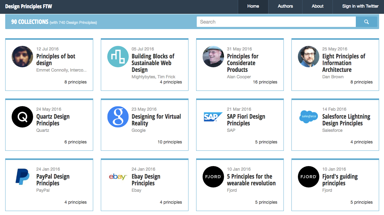
We came to the conclusion that we need to create a set of design principles. I set up a design team meeting and required everyone to present their ideas. I recommended a website called Design Principles FTW for inspirations. You can look up design principles from a list of companies, such as Google, Facebook, Apple.

Define Design Principles
We generated solid design principle ideas from the presentation. We needed to go deeper and define what they are. I set up a second meeting and asked everyone to write down their principles on sticky notes. Then we all put them up on the wall to group them and rank the importance.


