BY Jacob Johannesen
Larger companies are quickly realizing the value, if not necessity, of using design systems to keep bureaucratic disaster at bay.
But what about the little guys? When you’re moving fast, it can be difficult to take a step back and think in terms of systemized design. Beyond this, how can you systemize something that’s honestly still changing every day? While the idea of a “design system” has taken on mythic proportions in the product world, systemizing your product development process can be free form and grow with your company. It’s never too early to start thinking about your product in this way, but when it’s too late, it’s really too late.
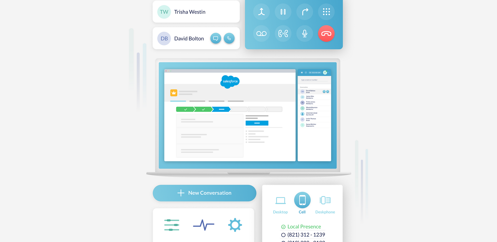
I’ve worked on the design systems team at one of the world’s largest tech companies, where I saw first-hand the results of waiting too long to implement a proper design system. By the time you’ve scaled, it will take exponentially more resources to undo mistakes that are now ingrained into your product. When I started at Truly, a startup building a premium phone system, I knew that we would have to hit the ground running with a systemized approach to design right off the bat.
In this article, I’ll go over my learnings from designing systematically for a quickly growing startup for a little over a year — and the mistakes and victories along the way.
1. Design In Two Threads
With any product, there is a battle between refining ideas and building pressing features. For startups, particularly, this really isn’t a choice — you have to build and ship constantly. This makes it necessary to create a second “background thread” in your product development process focusing in on refinement of your overall product rather than individual features.


At Truly, we designed and shipped features continuously. At the same time, we had a behind the scenes “Desktop Redesign” project, where we would focus about 25% of our time on refining our existing product without being bogged down by limitations. Anything was on the table in this “ideal version” sandbox of our product. We let these designs simmer and evolve slowly over 6 months, and were eventually able to implement a complete redesign of the desktop app in just 2 months working off the designs and specs generated from this investment.
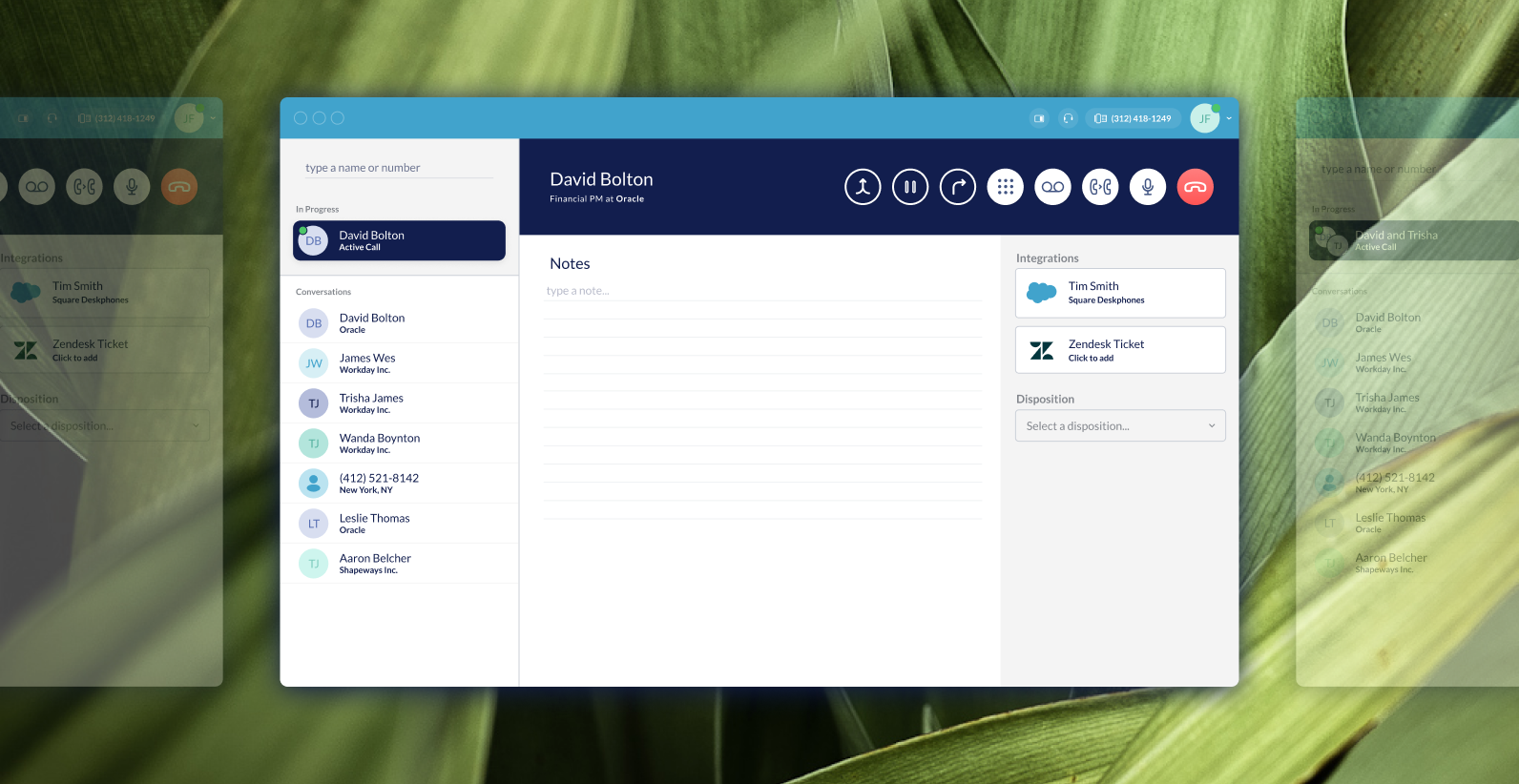
By having two threads in your product org, you can repair the leaks in the hull of your ship while getting it pointed in the right direction.
2. Atomic Design Isn’t Linear
You’ve probably been linked to Brad Frost’s Atomic Design a hundred times by now if you read UX posts on Medium regularly. It’s a great way of thinking about your product should be composed, but often times building a design system is presented as a linear process. As Frost himself points out, it’s not.
It is at the page stage that we’re able to take a look at how all those patterns hold up when real content is applied to the design system. Does everything look great and function as it should? If the answer is no, then we can loop back and modify our molecules, organisms, and templates to better address our content’s needs.
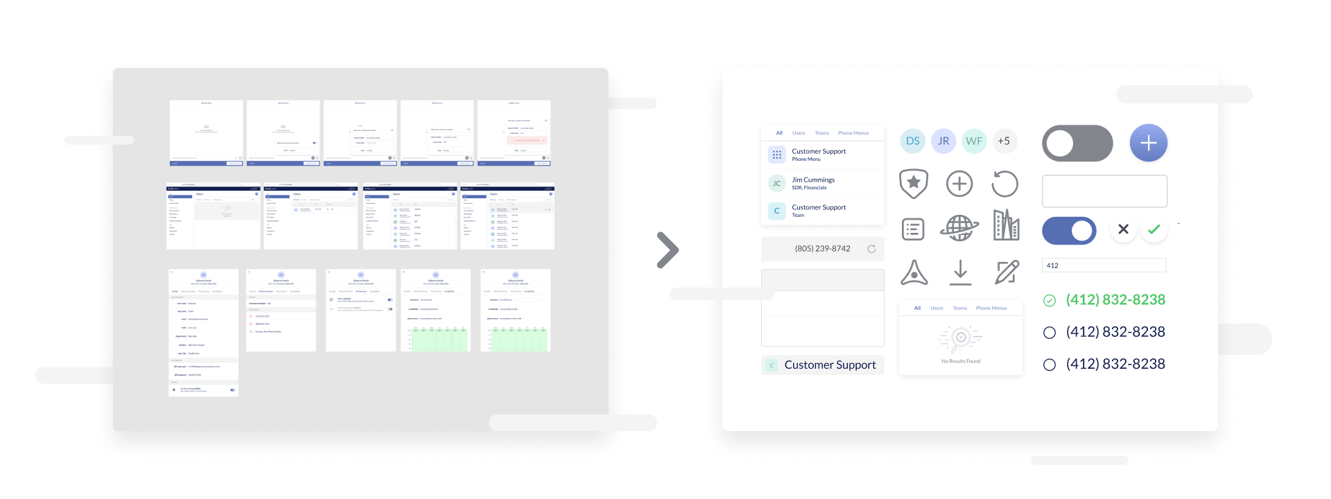
Rather than starting out by building out buttons and components (a mistake we made early on), focus instead on building flows and working backward from there. It took hundreds of sketches, brainstorming sessions across teams, wireframes, and mockups to arrive at a set of patterns that was usable across the majority of our product.

3. Know Your Customer. For Real.
When I worked at a large company, I remember the moment I finally found our design organization’s personas. It didn’t take long to realize why they were buried so deep it the design assets. One of them was “Millennial Mel” who “enjoyed drinking LaCroix”. As bad as the personas were, however, it really didn’t matter. A large company has already won the battle for the hearts of customers, and new features are generalized or handled by specific teams that know their section of the customer base well. If you’re at a startup, it means you still have customers to win over — and you need to know what makes them tick in order to sell them on your product.
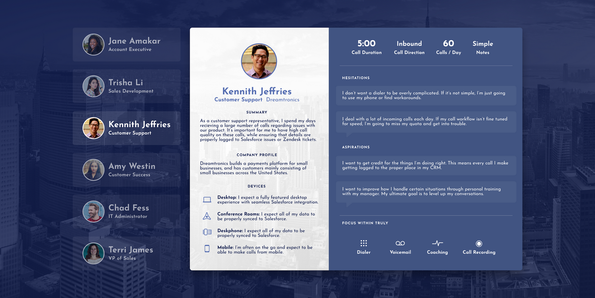
At Truly, we build a premium phone system for sales organizations. Sales is something that I’ve had minimal experience with, so I knew from the beginning that I would have to put in the extra work to get a good idea of what our user’s days actually looked like. I worked closely with our own team members that had regular contact with our customers to review problem statements and designs. Beyond this, I met with customers directly and read about a dozen sales books to try and get as clear a picture as possible.

4. Your Design System Is Never Finished. But If Version 1.0 Sucks It’s Never Going to Get Started.
When Google announced Material Design, it felt like a stone tablet had dropped out of the sky decreeing “Every design problem you’ve ever had is now solved!”. Looking at Gmail today, however, you’ll see some kind of Frankenstein offshoot of Google’s original drop-shadow-centric design system — and that’s actually a good thing. When Material launched, Google needed to make a bold statement to get design within their massive organization on track, and Material was the catalyst that allowed them to do just that.
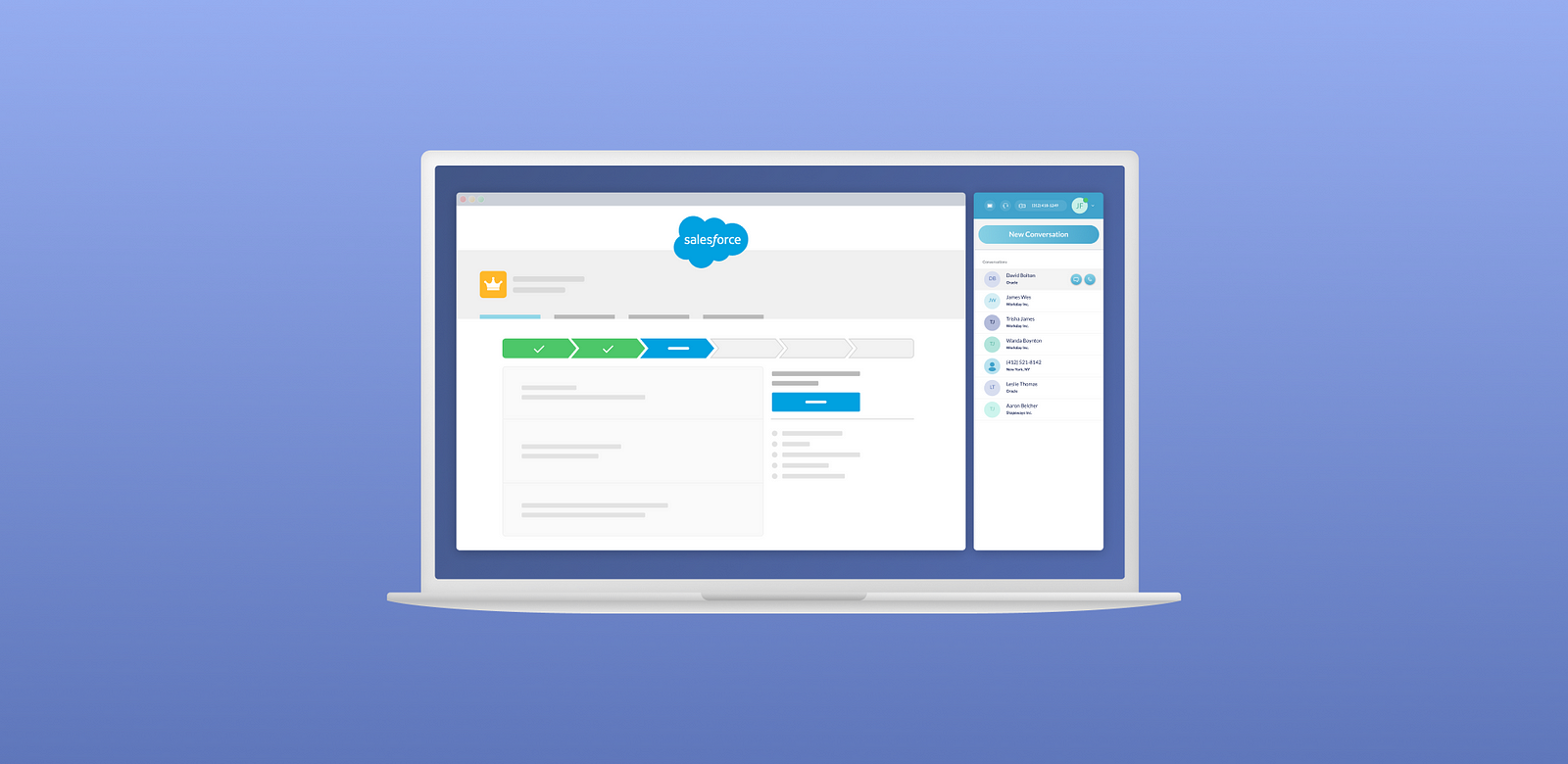
Even at the startup level, the first version of your design system doesn’t need to be perfect (it never will be), but it does need to make an impact. At Truly, we coincided our design system’s debut with the release of a new version of our desktop app. This meant working closely with our incredible engineers to get a front-end component framework started. At the same time, we worked with customer success and marketing to coordinate a redesigned desktop app launch. This launch would serve as a rallying point for the official launch of the design system — and gave us a starting point whereby we could start tracking what was working and what wasn’t.
5. Measure Success And Course Correct
The success of your design system should not be tied solely to how fantastic your gradient action buttons look. Instead, design systems add value to an organization in a few major ways:
Reduce Time Spent In Sketch: Design systems should reduce time spent mocking up individual features since there’s a set of patterns built that holds up against tested use cases common throughout your product.
Simplify Development: Work closely with your front-end engineering team to be an advocate for creating a library of components. At Truly, I didn’t have to do much to get our engineers excited about this — they were onboard from day one.
Build A Consistent Product: Finally, a design system allows your product to work in a consistent way, improving overall usability.
As we move into redesigning other parts of our product, we continue to go back to these goals to make sure we’re adding value to our organization.
